Rosa Fisher
Were you interested in animation/art from a young age? Any early influences?
Definitely! My bedroom walls were plastered with drawings of princesses with about a 99% coverage of drawings to 1% blank wall. I feel like it’s my complete goal to have the same feelings making art now that I did when I was a kid where I was doing it for the pure joy of it. I am still influenced by lots of the things I loved as a kid – I used to love the Swedish cartoon Alfie Atkins, which is just an amazing cartoon with such a sweet gentle tone. I also loved Hey Arnold and Spongebob.
Sent Away
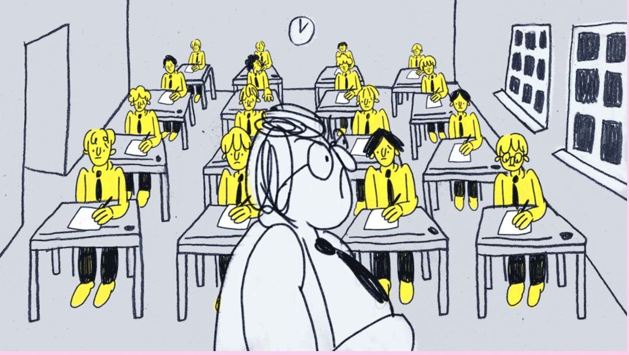
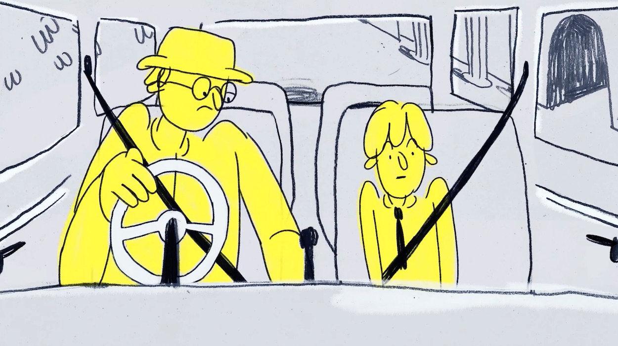
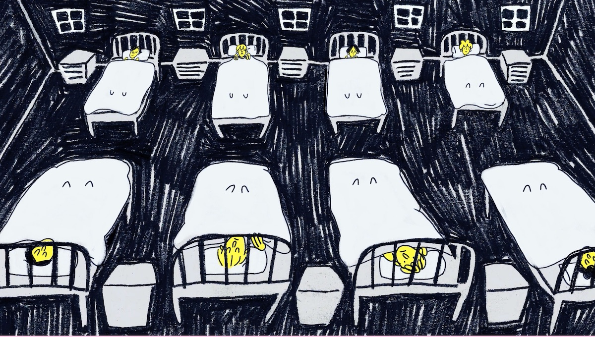
Your 1.4 award-winning film, Sent Away, is both a deeply personal piece – drawing on your father’s memories of being sent away to boarding school as a young boy – and a wider comment on the psychological, societal and political ramifications of ‘boarding school syndrome’. Can you tell us a bit more about what sparked the idea, and what it was like working with your father for the project?
It was something that my Dad had talked about loads throughout my life, and this made me really invested in showing the kind of damage that these institutions can really do. They have a dramatic effect on the individual on a personal level, but affect society as a whole. I think there’s also a sense that because the people who’ve gone to these schools are from a privileged background it shouldn’t matter, and that they’re just lucky to come from privilege, but I think this is really a disguise for the huge damage these schools can do – as you say – on a societal, psychological and political level. This made it feel important to draw attention to this issue as maybe it can be easily overlooked because of this. It ended up being such a lovely thing to do with my Dad too, and I loved learning more about his childhood with details I’d never known.
As an animator, your style is deceptively simple, but you’re able to convey so much in just a couple of lines. What does the creative process look like for you and what tools do you rely on?
Thank you so much! I definitely had to learn the power of simplicity – when I first started making work, I had a pretty ‘more is more’ approach but actually there’s so much boldness when you just focus on the important details. I think in terms of my process, the concept and idea is the thing that really comes first and then I’m searching for ways that everything else can help support and clarify that.
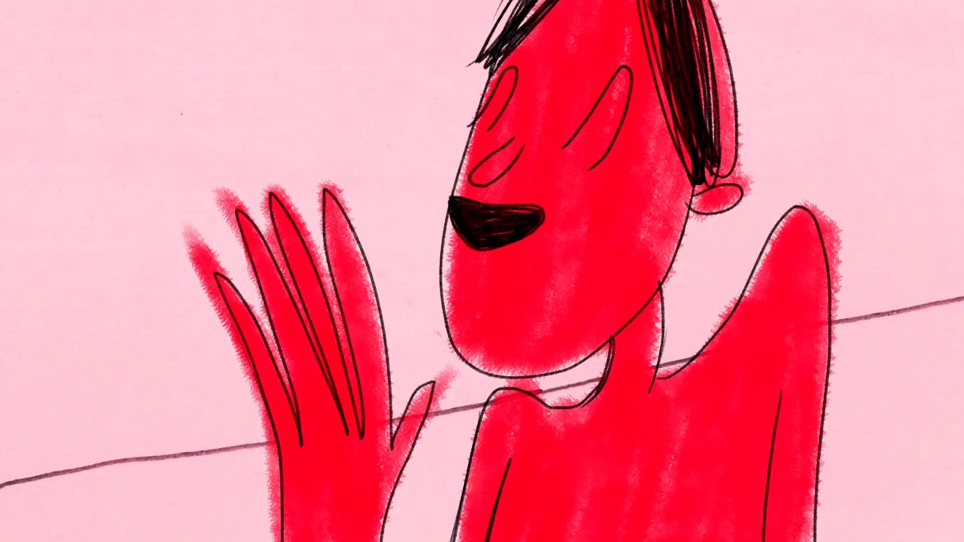
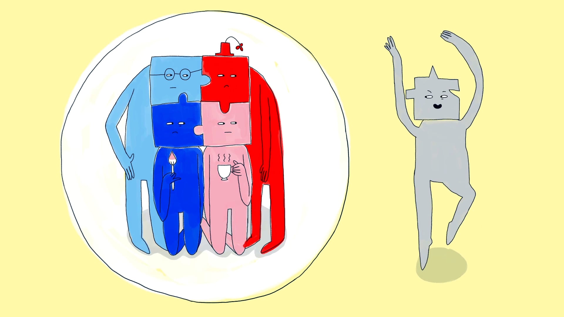
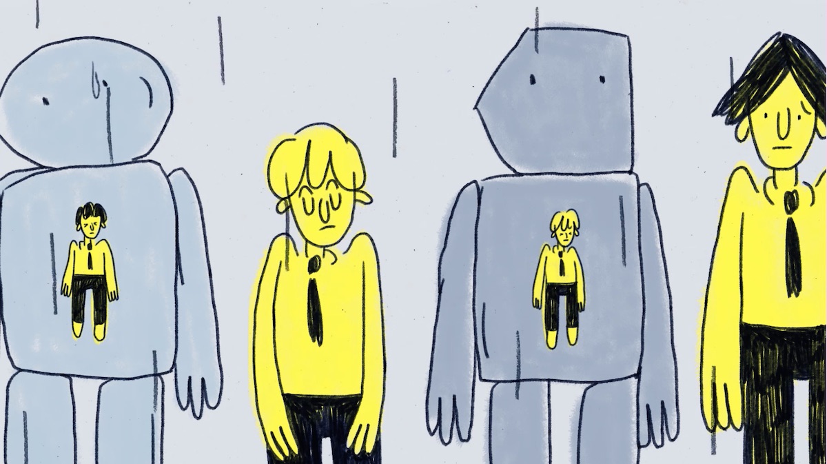
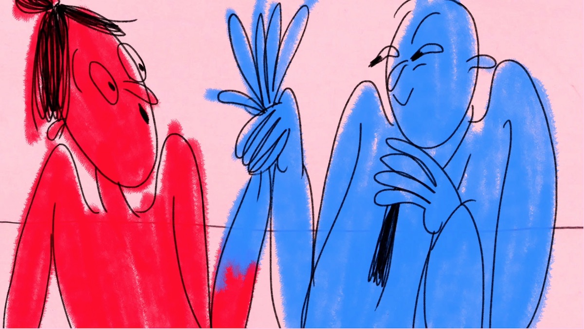
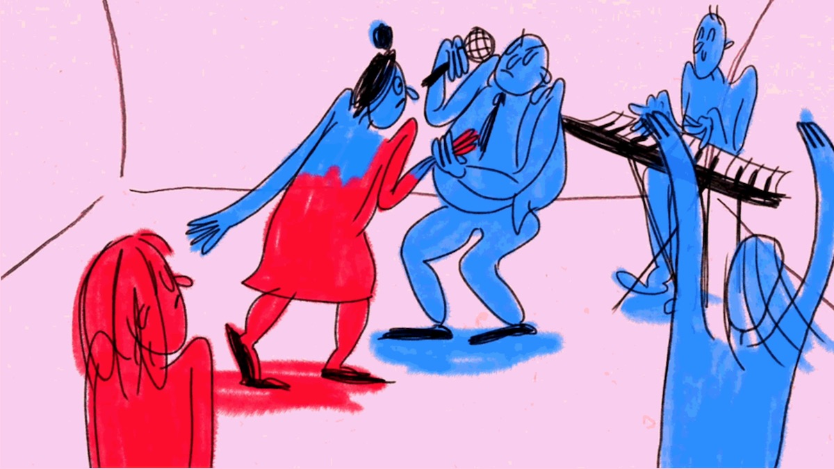
You work with quite a minimal palette, in which colours act as visual metaphors: in Sent Away, yellow reflects the confidence of the schoolboys, which gradually turns to grey; and in Elsewhere, red correlates with a sense of individuality and independence of spirit (at least, that’s how I saw it!). Tell us a bit about the role of colour in your work.
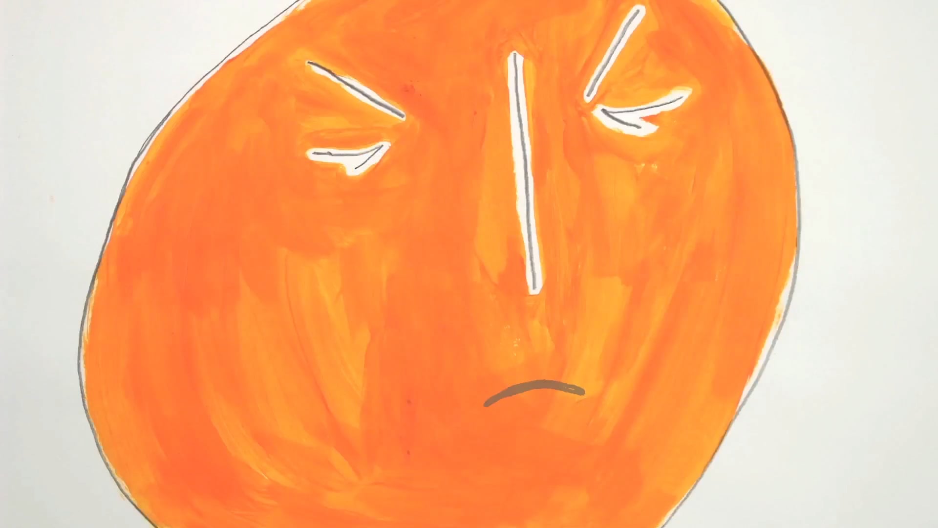
Completely accurate interpretation – I’m really glad that came across! I’m really inspired by things like UPA animation traditions where they leave out a lot of detail and just show important elements with bold block colours, so that has definitely fed into my colour choices. Definitely in both animations I was trying to convey quite abstract ideas, and I thought the metaphor of using bold colours was a good way of grounding those within the film’s visual language.
Elsewhere
Music and sound design are of course key to animation, and the way the French horn is used throughout Sent Away is particularly evocative: did you work with a separate musician and sound designer?
I worked with an amazing musician and composer, Martino Gasparrini, who completely elevated the score and sound design to another level. Having the French horn running through was a choice I made quite early on to use as a metaphor for his sense of self warping and changing. We recorded my Dad playing the French horn for the score, too, which I thought was particularly poignant.
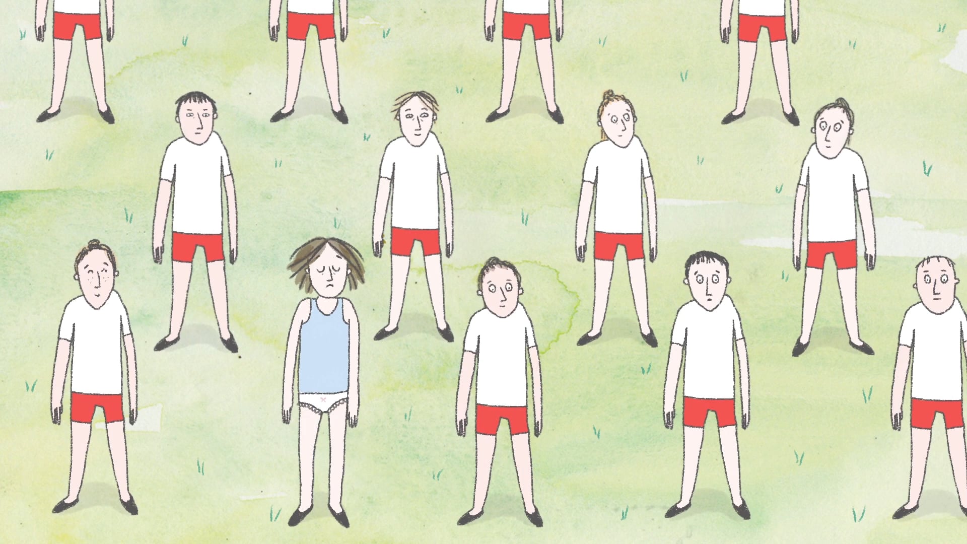
Idiosyncratic individuals/outsiders versus the conforming masses is a recurring theme in your work, from P.E. to Elsewhere and Conformity Juice. What draws you to this theme and is there an element of personal connection to it?
I only realised later, looking back, that this was a theme that continuously crops up in my work: I really am drawn to topics that are anti-establishment and about embracing individuality. I think I’ve always been a bit of a rebel, and institutions that maybe have tendencies towards penning people in frustrate me and I just want to challenge it. This has definitely fuelled a passion in me to make films about it multiple times.
What other topics, themes or causes interest you as a filmmaker?
I’m really interested in themes of masculinity which fed into this film quite a lot. I am also really interested in exploring the creative process and how you can creatively sabotage yourself through anxiety and overly comparing yourself to other peers and artists. A close friend and I planned to make a film about this, and we were well on the way to making it when the pandemic took over and put the brakes on it, but we are definitely going to go back and make it at some point soon. It’s going to be a combination of 2D animation and stop motion.
What’s next for you after winning a 1.4 Award?
I’m working in the lovely animation studio Scriberia, and enjoying being creative through these weird lockdown times. I’ve also started making reversible embroidered hats which I’m planning to sell on my website soon.
Interview by Selen Schleh
Rosa Fisher website
