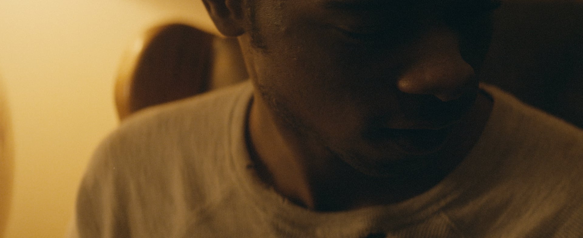
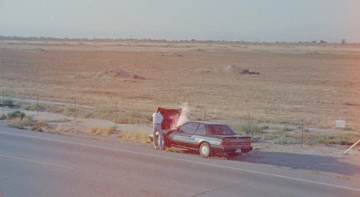
James Vincent McMorrow, I Should Go
First things first before we get into your new promo for James Vincent McMorrow – apologies! This is your first time featuring work on 1.4 and all we can say is it’s LONNNNNNNG overdue! So while you’re a new addition to the 1.4 family you’re far from being a new director. Could you tell us a little about yourself and how you got into filmmaking?
Thanks so much for having me! I’ve been a fan of 1.4 for a long time.
I first got into filmmaking when I was about 18 and taking classes at a community college trying to figure out what I wanted to do with my life. I had never touched a camera, but was always interested in film and by chance the college had a video production program that was extremely hands-on. Immediately I gravitated towards editing and the process of manipulating footage in Final Cut Pro into something worth watching. I transferred to Chapman University’s film school and after graduating I started working as an editor for commercials, music videos, infomercials and to be totally honest: anything that paid. From that experience I quickly figured out that my love for editing only extended to projects that I was invested in creatively. And I knew the only way I could control that was by writing and directing projects myself.
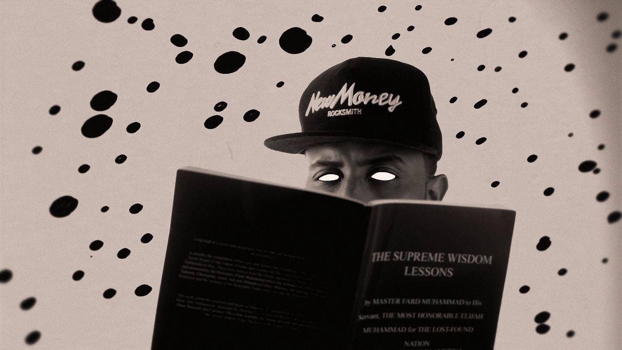
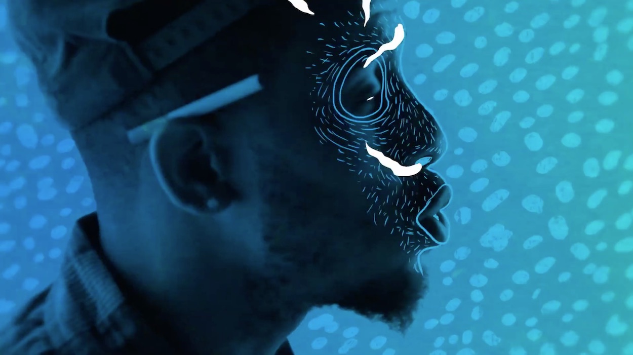
While I was trying to figure out how to get a no-budget mumblecore film off the ground, I fell into directing music videos by complete accident. A friend from high school was promoting hip-hop shows in Boston and crossed paths with LA rapper Blu. I don’t know what compelled my friend to share my college films with him, but he did and Blu reached out asking if I could direct a music video for him and Flying Lotus. I had no clue what I was doing, but I put together a treatment based on an email conversation between myself and UK-animator Ruffmercy. The idea was an experiment mixing a live-action performance with Ruff’s animation. That video managed to gain quite a bit of traction online and jump started a career in directing music videos on nights and weekends for many years while I was still editing for a living.
Blu, Doinnothin. Mix of Helman’s live action and animation by Ruff Mercy
Across a lot of your work the focus is strongly on abstract narrative filmmaking, creating deliberate moments of harmony and discontinuity between the music, lyrics and your imagery. In the case of your new promo for James Vincent McMorrow it feels like you took the song title, I Should Go, and reverse engineered a narrative to lead up to that one sentiment. Could you tell us about your creative process for building the story, character, tone and world of this film?
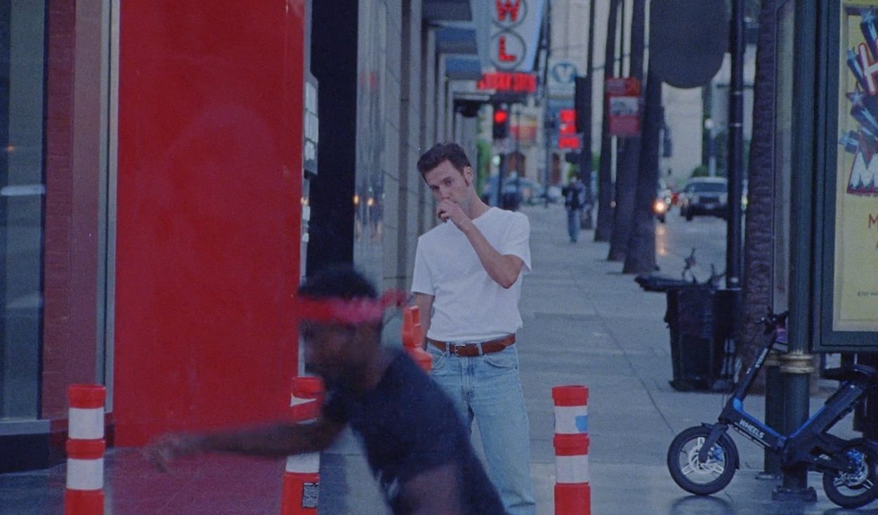
In an early conversation I remember James telling me how the lyrics came from this feeling of missing out and that he wanted to tap into that sentiment in an irreverent way for the video.
The initial idea for the character came from my experiences casting for projects over the years. I just find the process to be so uncomfortable and I feel so much sympathy for the day in day out grind of aspiring actors. So I had a rough character sketch of this struggling actor / influencer living outside Los Angeles, but it came to life when I asked my friend and talented director Ezra Ewen to work on this project with me. I met Ezra at a wedding about a year ago and soon after discovered his directing work. I remember watching one of his videos that he starred in himself and I found his natural charisma to be undeniable.
In conversations with Ezra, we knew we wanted to develop a character that despite his narcissistic core still had good intentions and retained a positive, unjaded view of the world. Collaborating with Ezra really opened up so many possibilities because he’s completely fearless and committed as a performer.
The piece we’re featuring today, your latest promo for JVM, fits into a line of work you’ve created that mashes together aesthetics and techniques of shooting on digital and film. Could you explain the differing appeal of these two formats and how their specific shooting styles impacts the creative and tonality of your work?
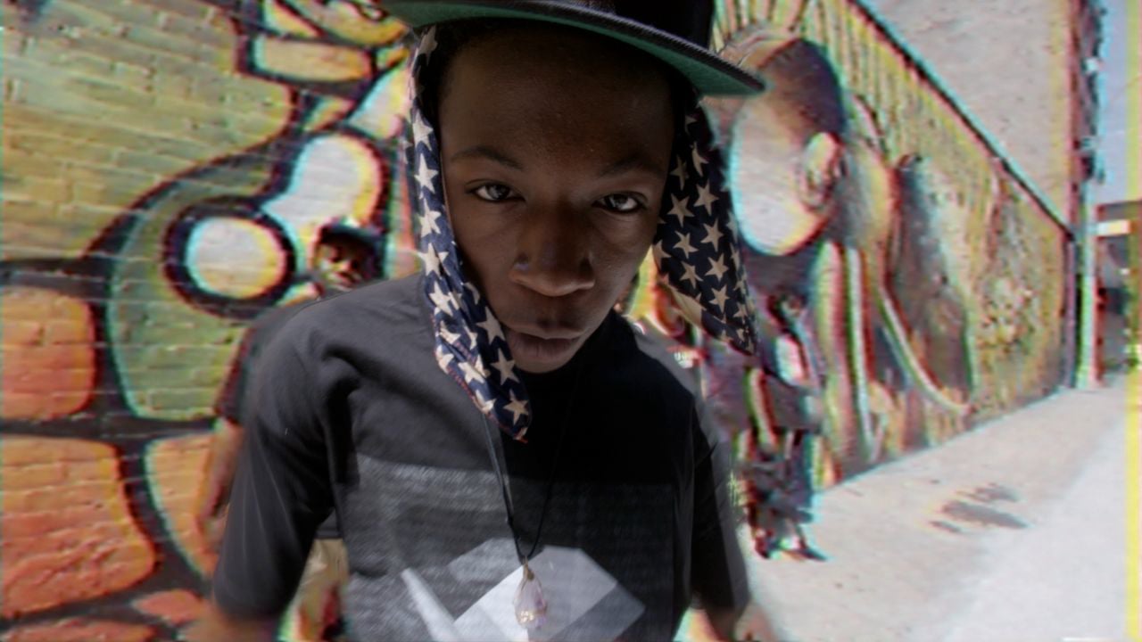
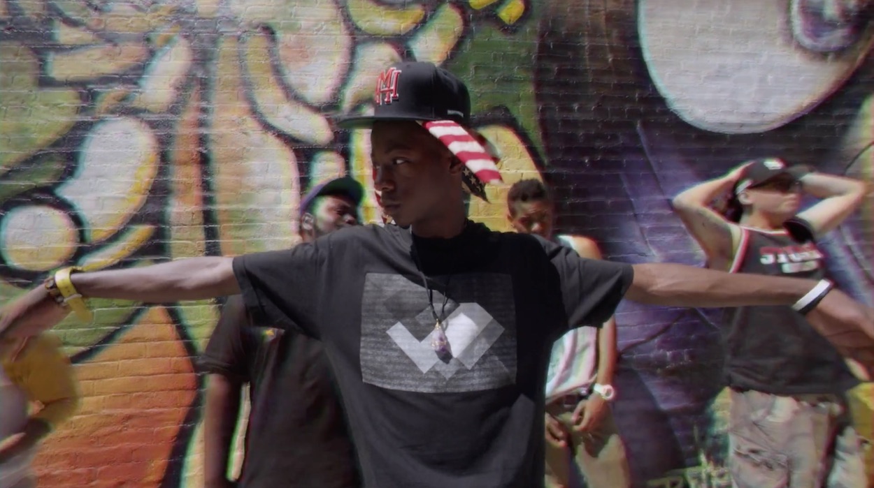
Mixing formats is something I’ve been interested in from the beginning. Even with one of my earliest videos for Joey Bada$$ I was experimenting with blending VHS with 4K footage. Although it’s become something of an aesthetic trope; I do think that if it’s done right it can be compelling.
Whether it’s film or digital or analog or animation it’s key to let the narrative or concept of the video dictate the choice. So with each project I’d say the intent is different. For Joey Bada$$ it was about creating a visual metaphor. Joey was a young Brooklyn rapper rooted in a golden-era hip-hop sound. Shooting a classic fish-eye performance with the background analog and Joey rotoscoped in HD was just a visual interpretation of that idea of new and old colliding. And for the JVM video, the inclusion of cell phone footage is some kind of reflection of social media narcissism. It serves as a window into Ezra’s world from his point-of-view set against more formal lens of the narrative.
Joey Bada$$ – Fromdatomb$
If I had to pick one word to connect your more narrative work I’d probably say “disillusioned” – from the character Zayn plays in your Entertainer promo (and his self-delusional and damaged dance along the line of rejected, impossible or toxic love) to the STAGGERING Cold Little Heart (more on that shortly). And that theme flows into your latest piece too, a character projecting a fantasy that they try to inhabit only for it to fall away at the moment it’s been leading up to (or does it? Perhaps his “I should go” line is actually part of the casting tape performance?)
The question! – what is it about this theme / idea / space that interests you creatively / psychologically?
I’ve never thought about this, but if there’s a theme of disillusioned protagonists across my work my guess is that it could potentially come from the constant rejection that comes with this industry. I might be channeling my own personal frustration with the ups and mostly downs into some of these ideas without knowing it.
I also think my natural inclination is to lean towards melancholy. Which is partly why ‘I Should Go’ was a welcome change of pace for me. I’ve typically steered away from comedy, so figuring out how to incorporate levity and a sense of humor along with some melodrama was a challenge. Humor and drama are one-degree away from one another so riding that line is something that I hope to continue to experiment with.
And building on that – ambiguity of meaning and outcome is a persistent element of your filmmaking. Even back in 2014 when you released your short film Waves you were already exploring this refusal to prescribe meaning or give a clear narrative path to the viewer. How far would you say this is due to the formal limitations / restrictions of short film and music videos or is this tension between form and narrative intrinsic to what your work is about?
The idea of making something literal and conclusive has always felt a bit boring for me. I typically gravitate towards films that leave you asking questions. So I think when I write I unconsciously avoid buttoning up all the narrative threads and instead try to allow space for the audience to walk away with their own interpretation.
But I think you’re right, though. I think the short format lends itself to more ambiguity. Especially if it’s entirely visual. It’s easy for something to feel spoon-fed or contrived if it’s telling you how to feel within a 3 minute runtime. The more you can imply without overtly spoon-feeding your audience, the more chance it has to resonate without feeling manipulative.
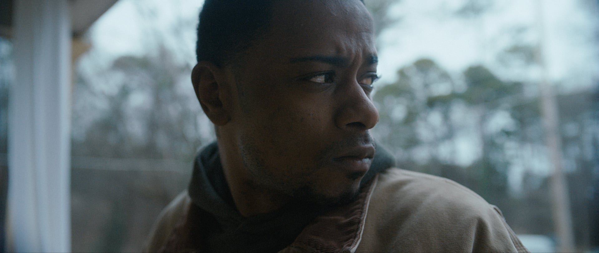
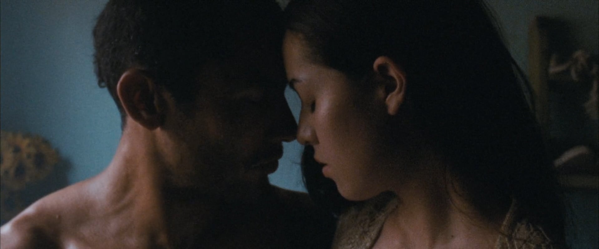
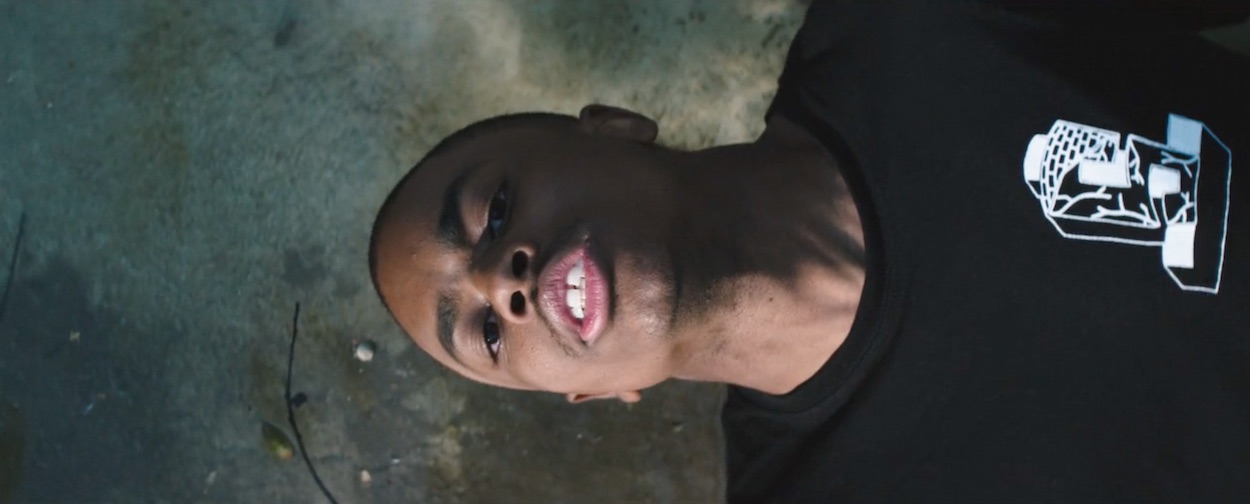
Lakeith in Moors, Asphyxiated
You’ve had a long and ongoing collaboration with the incredible Lakeith Stanfield (who starred in Asphyxiated, Waves, Cold Little Heart and most recently in the promo that you directed for his work as a musician under the HTIEKAL banner.) How did you guys first meet and connect creatively? And what is it about the synergy you share that has been such fertile ground for collaboration?
I saw an early screening of “Short Term 12” and walked away wondering who the hell Lakeith was because he stole every scene of that movie for me. When I got home I did a quick search on Twitter and saw he had like 100 followers and a Soundcloud link. I loved his music and reached out. A few weeks later we shot the video for ‘Asphyxiated’ with a camera I borrowed from work and we’ve been friends ever since.
I could go on and on about how different and naturally talented he is, but the one thing I’ll say is that Lakeith is the most humble artist I’ve ever met. His work ethic is insane and he truly cares about every project and every person he works with on a deep, emotional level. Watching his rise has been incredible.
From Michael Kiwanuka’s Cold Little Heart
Right – Cold Little Heart, it’s time to dive in. This film is frankly outstanding. Congratulations. So many questions! The lyrical ambiguity of the song is matched perfectly through the abstraction you build in the film. Rather than asking what the film means because it seems like a literal reading is beside the point, could you perhaps explain what you wanted to convey and communicate in a non-literal sense with this piece?
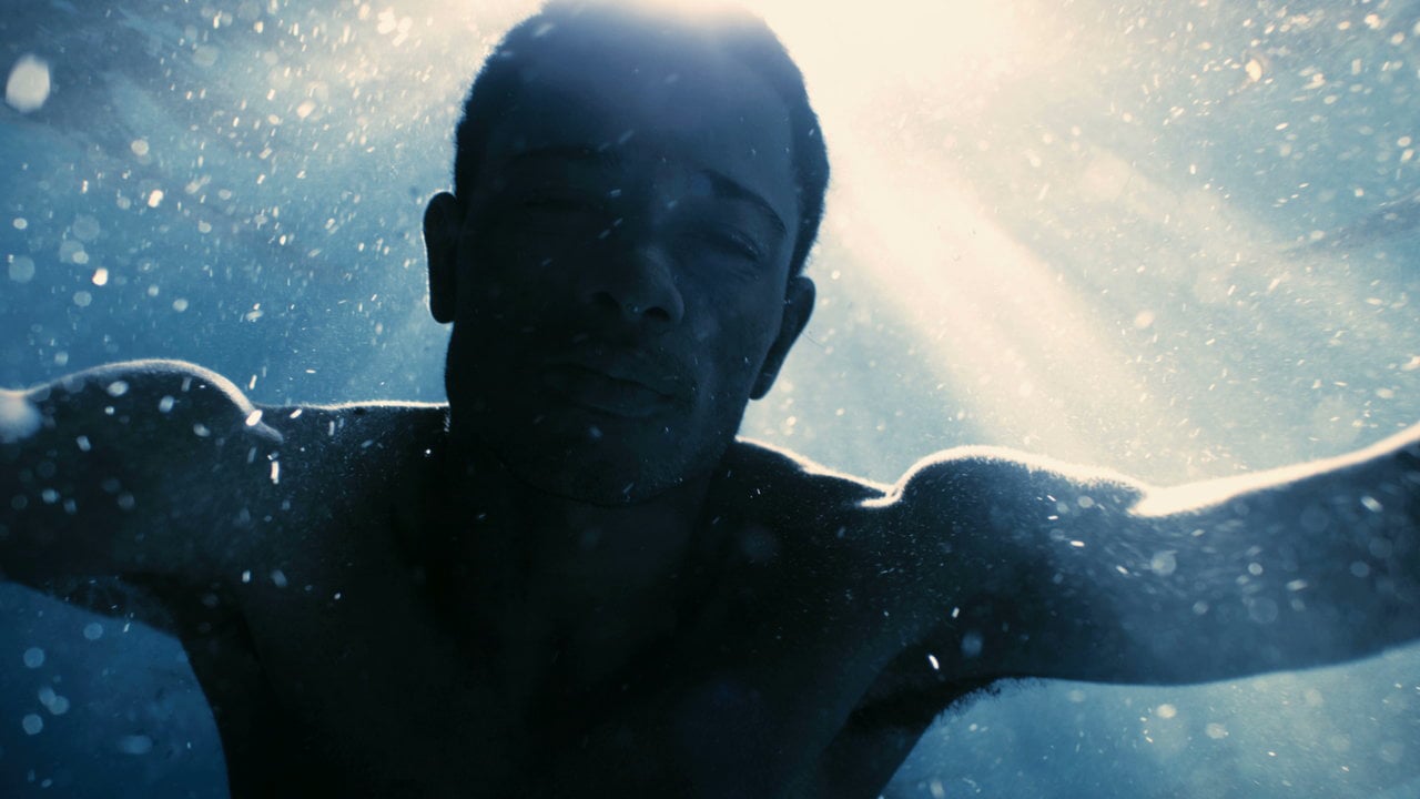
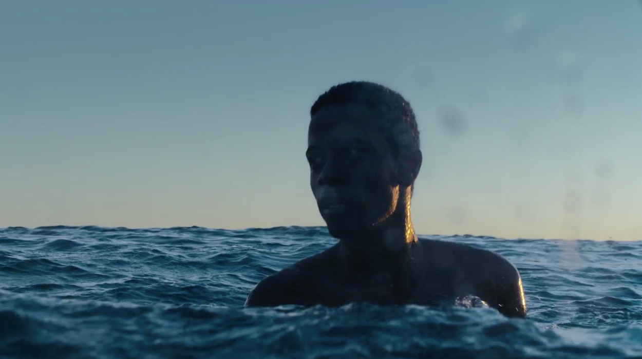
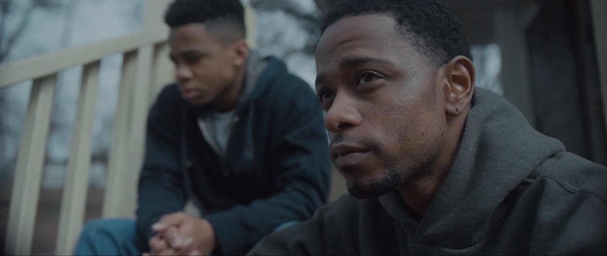
At the time I had just made it to the other side of a pretty difficult year and I was waiting for the right project to come along to try and channel some of those experiences. Specifically something centered around grief. So when I was sent the Michael Kiwanuka track I just put all these thoughts and images into a blender and threw them on the wall in the form of a treatment. From the beginning it was intentional to bend the lyrics of the song to motivate a narrative that represented a different kind of heartbreak. The loss of a father-figure and the subsequent fallout was something I was more interested in exploring. And to be honest, I didn’t think they would go for the idea, but luckily the label and Michael were onboard to do something different than what they originally set out to make.
Speaking to your previous question of ambiguity in the work, I remember not feeling confident in the original ending that I wrote because it was very literal. I couldn’t figure it out until we were in Atlanta and shooting the opening sequence when I stumbled onto this idea of feeling stuck in a loop of grief. At the time when I was trying to process my own loss, time became disjointed and days blurred together. After some brief hesitation on my part Lakeith, cinematographer Trevor Wineman, and I quickly improvised and shot the ending that made the final cut.
Vince Staples, Lift Me Up
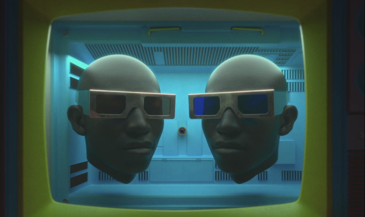
In parallel with the projects we’ve discussed so far you’ve had and continued to have dabblings with even more abstract filmic styles – specifically in your earlier promo for Blu’s track Doinnothin, Lakeith’s Birds – and drawing in more sculptural visual imagery in a lot of the work you’ve done with Vince Staples (in particular how you pose, frame and move the camera around his body as the performer). How does this more experimental style of work sit alongside your other projects in your mind? Do you see them as being part of one and the same way of seeing the world or processing aesthetic / emotional / psychological experience?
As much as I’d like to say I’m mindful of my past work, I’m usually just trying to make something I’m excited about that also feels appropriate for the specific project. And a lot of the time I think I’m actually trying to run away from whatever it is I just made.
I’ve always admired Steven Soderbergh and his reckless approach to taking on films. Where he can go from “Oceans Twelve” to “Bubble” to “Contagion” to “The Knick.” That kind of variance in scale and genre is something that really interests me. I find it exciting when an artist experiments and takes a stab at something wildly different. Even if it doesn’t work. I think I would get tired of attempting to make the same type of film over and over again.
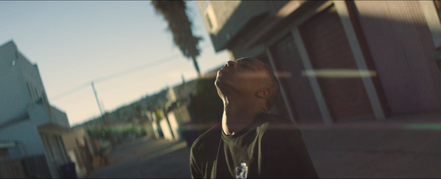
But with the performance-driven videos I have directed, I’m still trying to communicate some kind of tone or emotion. Even if it’s more impressionistic or overtly visual than the narrative projects. The success of those videos really begins and ends with knowing how committed the artist is to the idea and how much creative flexibility the label is going to give us. An ideal situation is like the ‘Lift Me Up’ video for Vince Staples where he was willing to work 14-hour days in a wire harness and trust my team throughout the entire process.
Artists like Vince are rare and more often than not I’m trying to strip away the artifice that labels push for and try to create an environment where the artist can be themselves and we can give ourselves the time to get it right. Which is unfortunately, a lot harder than it sounds, but if you can get away with it I think you have a shot of making something interesting.
Interview by Stephen Whelan
David M. Helman website
