In 2017 Sheila Johnson was awarded Kycklingstipendiet, Sweden’s most prestigious creative acknowledgement for new talent. This year she bagged three wins at the Roy Awards: Best Director, Best Film and Best Music Video.
Starting her career as an art director, she spent two years at McCann New York, producing award-winning work for top clients, from IKEA to Chevrolet, then returned to Sweden to follow her passion for directing. She is signed with New Land in Stockholm as well as Iconoclast in other countries.
Your film for Highsnobiety/Mercedes has very graphic compositions; with scenes divided into shapes, creating views through apertures: windows; sun roofs; barriers etc. How did this approach evolve? And how did the car inspire the look of the film?
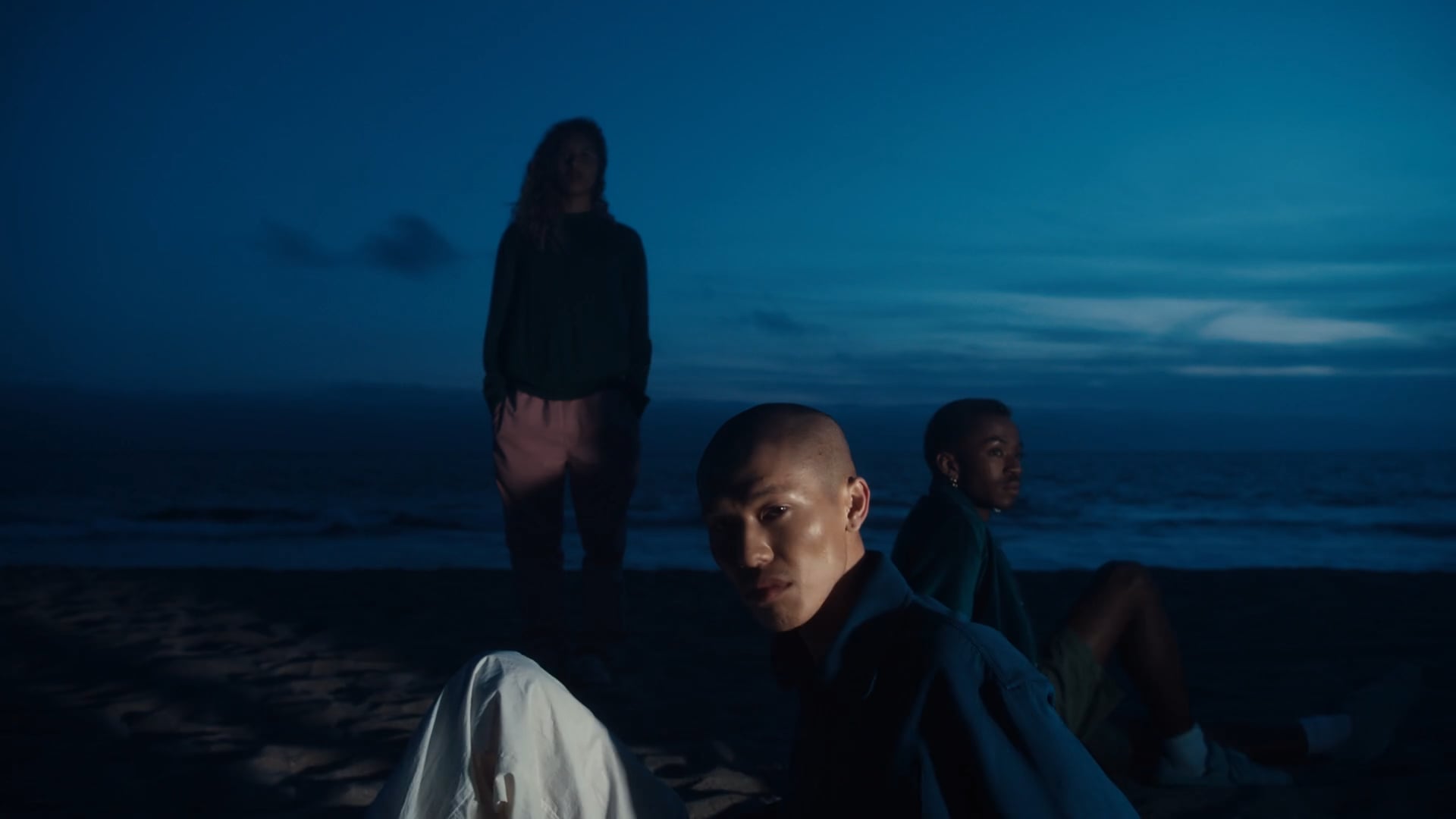
At the start of the process I knew I wanted to do something that was graphic and calm, to combine Mercedes EQ Concept Car together with Highsnobiety – it needed to be futuristic and fashionable; something that displayed the car in a different way than what’s usually expected in an auto commercial. Also, the film needed to question – without being too literal – how people want to move and connect with each other in the future. I think my main inspiration was the car itself, it’s very minimalistic and graphic and I wanted the cinematography to reflect that.
You worked with Kate Arizmendi before on a commercial for Åhlens, how was it being reunited on the Mercedes film?
It was awesome to be back on set with Kate, I love working with her and we always have so much fun together! We really understand each other and have similar artistic vision and likes and dislikes. The communication between us is very clear and effortless because we trust each other. She’s an amazing DP on all levels.
What was behind your decision to use the square sculpture you placed on the Californian beach?
It’s funny that you ask about that, on set it was something everyone just fell in love with! This strange opening to the sea became a symbol of going from one world to another. From the past to the future. It’s an idea based on a picture reference I liked that I’d saved on my computer – it’s an image from inside a hotel room I think; through an open door you see the sea beyond. From that picture this wall came to life! We hired a great set designer to build it for us, based on a sketch that I made with notes on the kind of texture I wanted – worn, peeling paint and a ‘concrete’ feel. We then placed it on the beach. In the beginning, it didn’t really have a deep meaning, but in the end I think it became something pretty magical.
How has your background as an art director influenced your film making?
I always gravitate towards a strong concept. I think that’s something that’s key for me when I approach a project and something that comes from my art director background. I need to have a core idea that I work from. It could be something that’s a prominent feature of the idea or maybe a visual rule that I set for myself.
Do you like to be very involved in the planning of the storyboards and cinematography, or are you happy to delegate those roles?
I’m a very visual person so I like to be involved in that process and have a talk with my DP about my vision in the early stages. I love collaboration and having open discussions. I think when you first talk with your DP something comes to life; you can push each other and question what’s the best way to tell a story and capture a scene. But when it comes to the technicalities of it I don’t really care. I don’t suggest lenses or anything like that; in that regard I totally trust my DP and their skill.
As for storyboards, in general I don’t like them, though they are good if you have time for them, maybe on longer projects. But on shorter project I rather have a floorplan and a shoot list to work from to be able to be a bit more flexible once on set. During a shoot, stuff always happens and sometimes magical things appear! When that happens I don’t want to be committed to a particular frame.
Your film for Cancerfonden (the Swedish Cancer Foundation) is very dramatic and moving with very subtle acting. How did you go about developing the story?
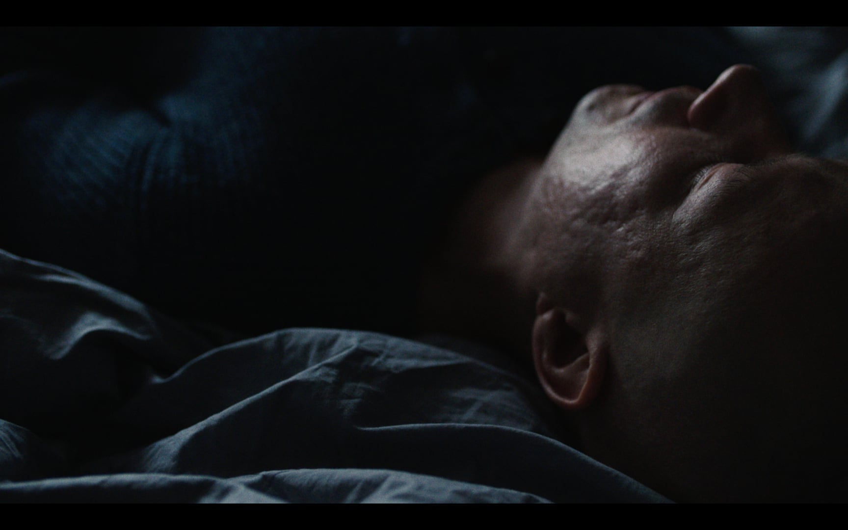
For this film we wanted to change the focus from just being on the patient and include the people around the patient as well. To show how family and loved ones are also in this extremely sensitive and fragile situation.
I wanted to focus on how people handle those feelings in different ways. Some people want to talk and be loving, others want to be quiet and pretend that everything is fine. Others get mad and scream. For me it was extremely important to be respectful of those different feelings, for the sake of all the different people struggling with cancer who might see the film.
We wanted to centre everything around the home itself; what happens within those four walls from one new year celebration to the next. In the end, we wanted to create drama and hope. Also, again, to try in our best way to tap into those feelings people who are suffering from cancer may have at that moment.
Your film for Polestar, Cyan Racing, about Thed Bjork and the team in the 2017 FIA World Touring Car Championships seems to counterpoint human nature/biology and engineering/technology, please tell us about the development of the film and why it was shot in black and white?
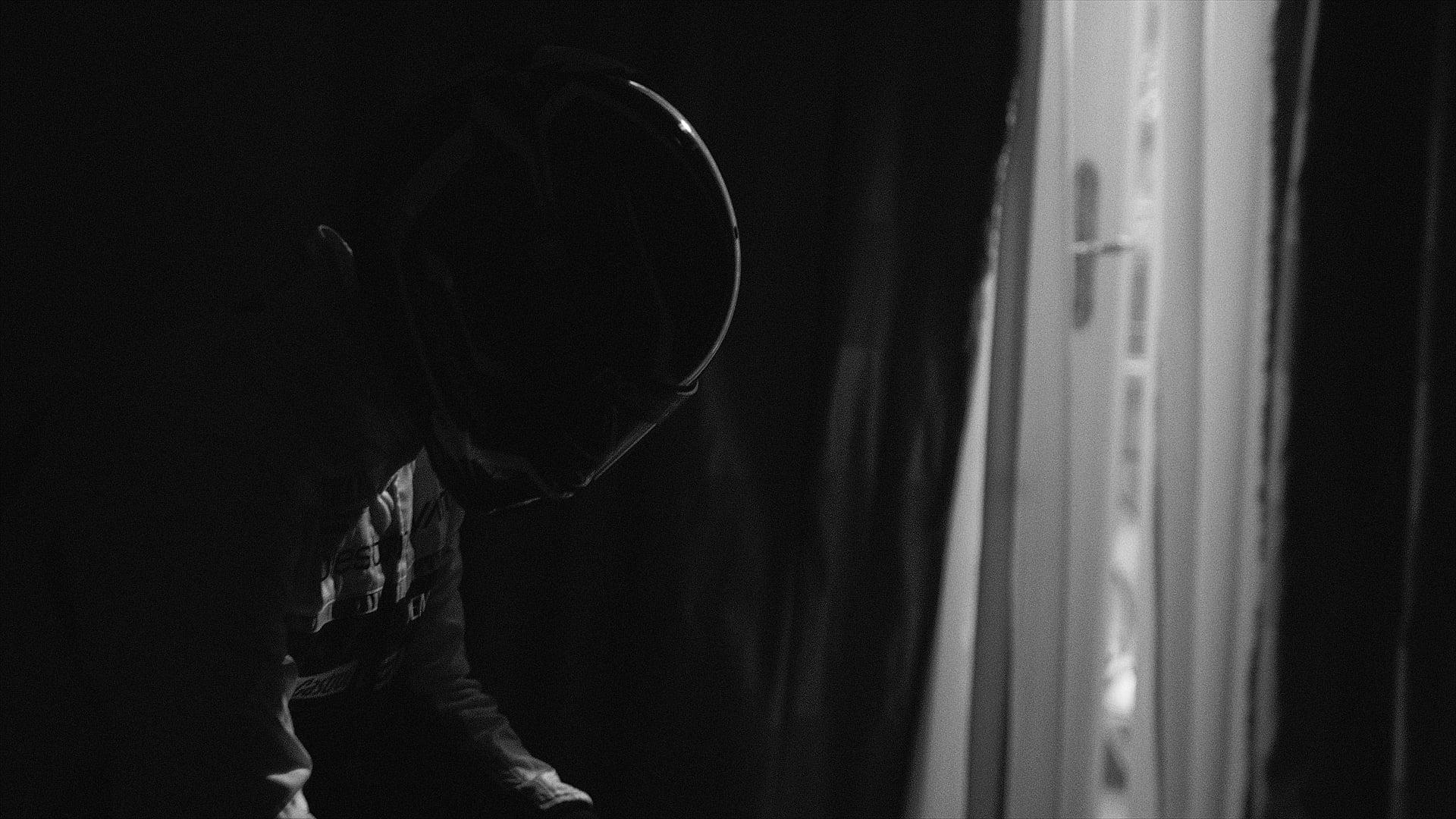
We wanted to tell a human and emotional story about the race against time. And to include the time before the race, when the driver was mentally preparing for something extremely challenging; to pull the focus away from horsepower and rubber burning and put it in the details about the hardworking people behind the race. We kind of developed two stories: one that’s more talked about – one man’s inner feelings as he prepares to drive; and the other story is the endless work of others to ensure he has the best conditions possible to win. We also decided to work a lot on the sound; to move away from the usual car sounds as much as possible and focus instead on expressing the racer’s inner journey.
It was the agency’s (Forsman & Bodenfors) decision to shoot in black and white and I loved that idea. Especially when we shot in different location that we couldn’t modify, it meant that keeping it in black and white gave a cohesive look to the film.
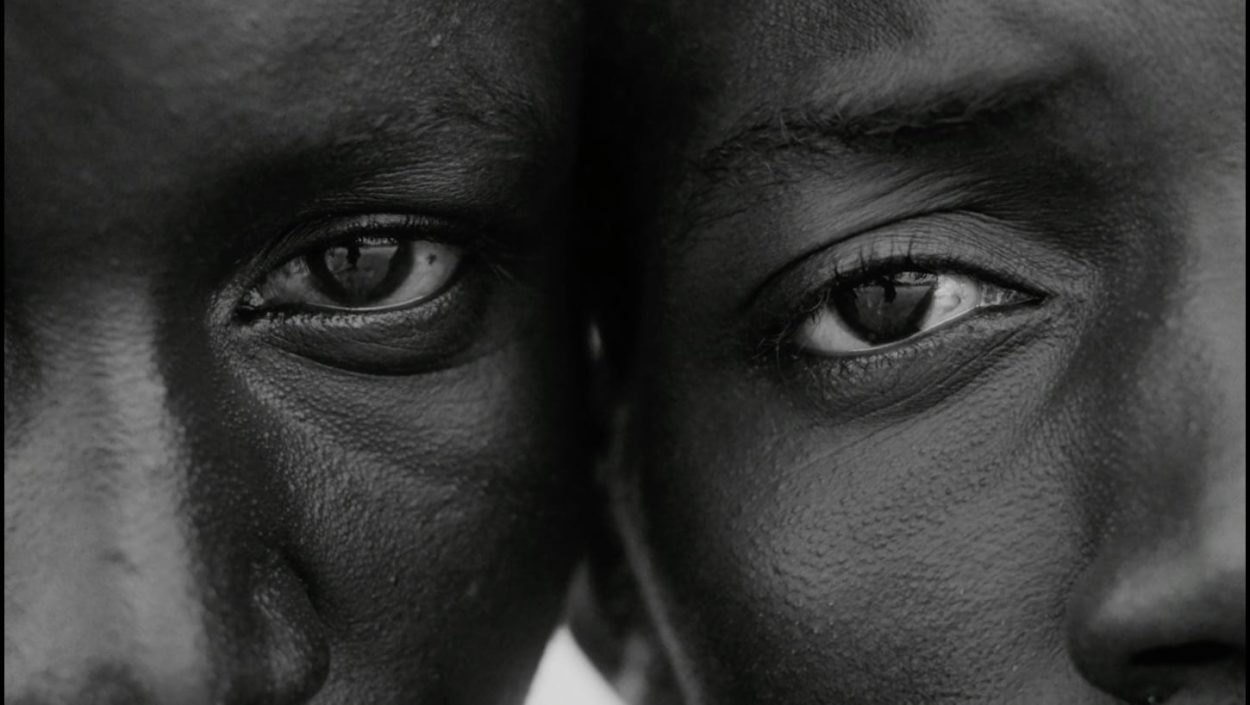
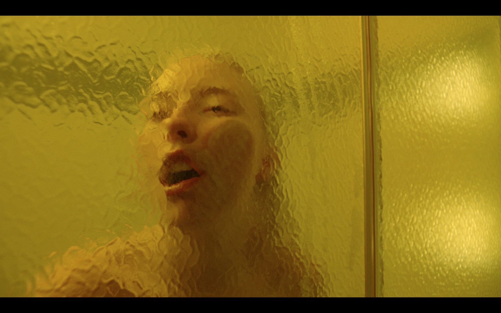
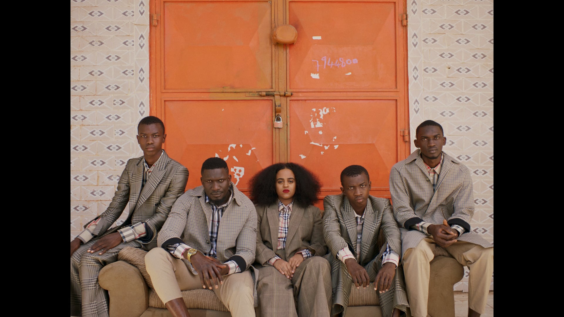
Your video for Seinabo Sey’s track Remember is also in monochrome, and is full of sensual textures – chiffon fabric and frothy waves, water, skin, reflections on wet sand. What was behind your decision to use black and white here?
This was actually a decision we made on set, and I am very pleased with it! We had trouble with the location and the weather which meant we had to change plans and be creative on the spot. To make the footage match better and to be able to work more freely we decided to go monochrome. I think the video became so more fragile and evokes a sense of memories in a way that really works with the track and the lyrics.
The funny thing is that when the colourist showed me a colour version of the film, it’s also amazing! But in the end, I was super happy that we went for black and white.
Your films for Åhlens’ skincare and for the Folkoperan Turandot opera display a great flare for directing comedy. So you seem to be happy directing drama/comedy/fashion … what is your favourite genre?
Hum… this is a hard question. As I’ve said, what is most important to me is to start off with a very strong concept and work from that core. So I’m open to all types of genres. But if I have to choose I think drama. At least that’s what I want to do more of in the future.
What were your interests when you were studying at Stockholm’s Beckmans College of Design? When and why did you move from design to directing?
I had always been good at drawing as a kid; it was a big passion of mine growing up. I was also interested in film so these interests led me into animation and when I went to high school I studied art and majored in animation. I learnt how to animate frame-by-frame and I made short films for school assignments.
But after high school I kind of went another direction, more into art and design. While at Beckmans I actually always thought that I would become an illustrator or graphic designer. Then one of my teachers looked at my portfolio and suggested I was more of an art director than a designer. He said that all my concepts and ideas were strong and that was more a career I should pursue.
So there I am in New York working as an art director and when I am on shoots the realisation comes to me that my interest in film has really grown and I want to be on the production side. I didn’t like the fact that the majority of my working life was in an office. So I decided to quit – I gave up New York and my visa to move back to Sweden and become a director!
Who or what inspires you as a director?
It’s hard to say because I don’t really look at one thing continuously for inspiration. It can be someone I see on the subway, a photographer I follow on Instagram, an art exhibition or a story I hear from someone. It’s kind of everywhere…
Interview by Carol Cooper
LINKS
