There’s a distinctive art direction in your work – whether it’s in your music videos or in this commercial campaign which you’ve just completed for Chambord. Please tell us the background to how your design style evolved?
I studied graphic design at Central St Martins, which helped me develop a keen eye for composition and graphic art direction.
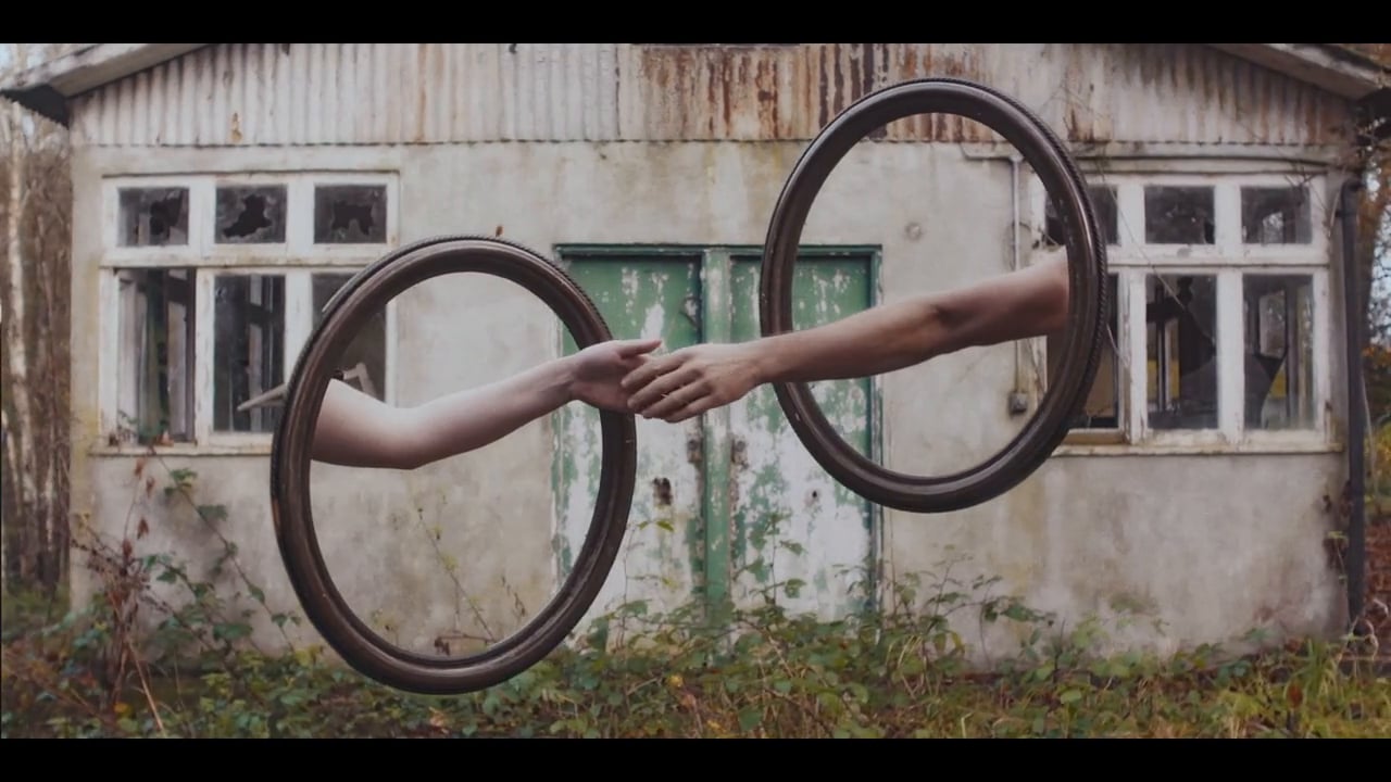
In a lot of my work there is a playful juxtaposition of seemingly unrelated objects that, when brought together, create new meaning. This really inspires me. I have always been quite playful in my ideas and I enjoy subverting reality.
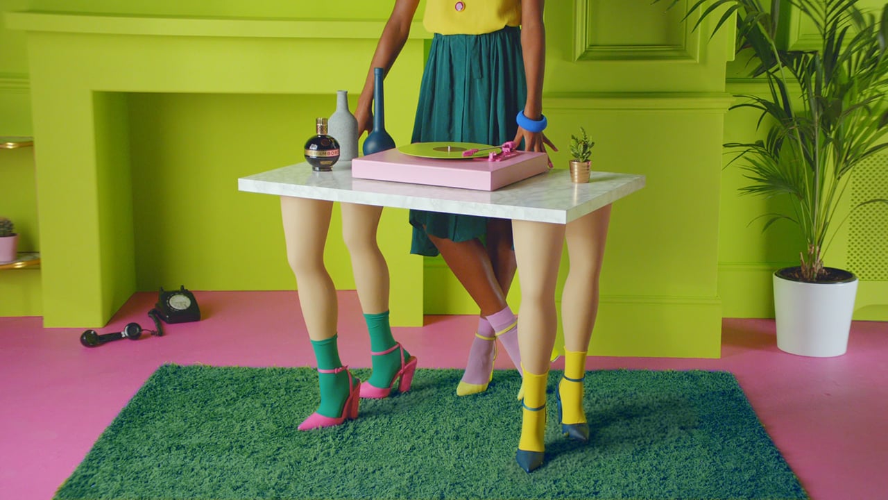
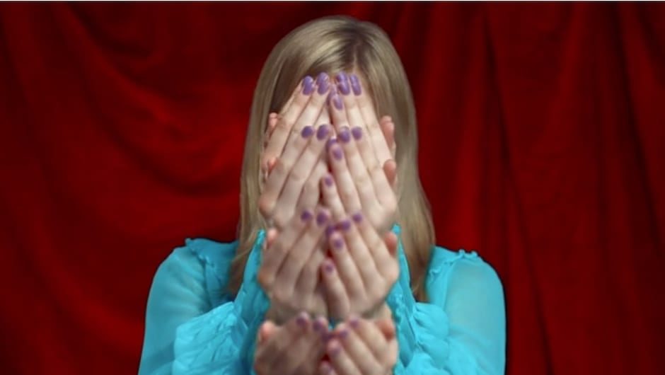
I’m also really fascinated by colour and texture, which is very evident in my stills-based work. I really wanted to take that further in this piece for Chambord and I am really happy with the colour palette that I chose for these films.
Do you think out your ideas on paper or do you design on the computer?
Both simultaneously. I have a love/hate relationship with technology. I tend to remember things better if I physically write them down. Usually I write down initial thoughts in a notepad and then develop them in venn diagrams before sketching ideas up in Photoshop. During my creative process I usually go back and forth between paper and computer.
I have started using Pinterest to keep track of all the wonderful things I see on the internet and for making mood boards before I start writing up a project.
Do your ideas come to you randomly and you store them until an appropriate project comes along or do you start from scratch for each job?
Working to a cohesive brief is something that has always excited me. I love responding to a creative that someone has already thought about and either taking it on a new path or bringing something new to it. I strongly believe constraints breed creativity.
I do however have a backlog of great ideas that are just waiting for the right track or brief to come along. So, it works both ways.
What was the original brief for Chambord and how did you develop it with your treatment? Did you storyboard everything in detail?
I related so much to the Chambord brief it was freaky!
The Chambord world they described was very similar to my own visual aesthetic. A world of absurd logic, bold and simple graphic compositions. A balance of playfulness and nonsense. These are things that I love to play with and that I use to generate a lot of my ideas. So for me, this was one big familiar playground and I had a lot of fun with it.
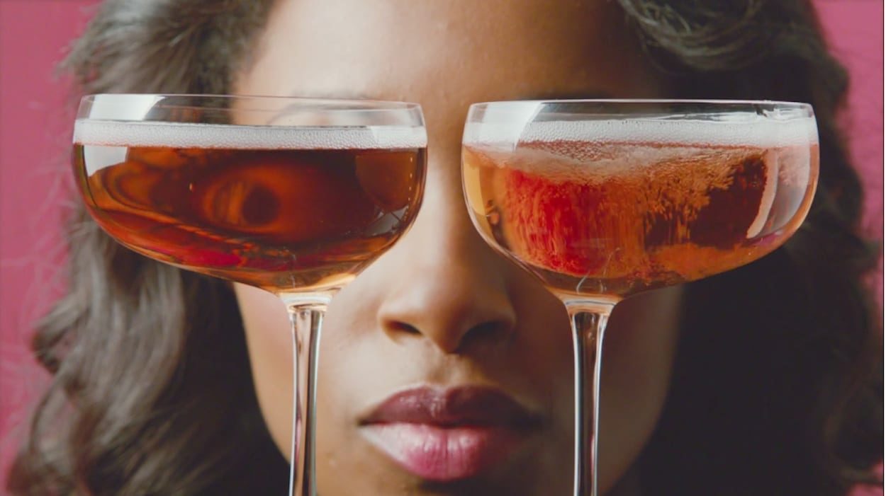
In the brief, Chambord mentioned that the mixing strategy should be unconventional, but it was up to me to suggest ways to bring that to life. Encasing the glass in ice, the water pistol, the eyes looking through the glasses while dropping the raspberry and the eyelash curler squeezing the lime were some of my favourites.
What was really important to me was the look of the films. Chambord already had a really beautiful aesthetic and I wanted to create something that would fit into that world but be a bit bolder in its colours and art direction. The Chambord Margarita has the bravest of the colour palettes and I’m really proud of taking a risk there.
It was important to me that everything was impeccably designed. My storyboards therefore had to be very accurate to the final shots. So much so, that I coloured the boards, frame by frame, with a pantone reference. I wanted to make sure the art directors knew exactly what shade everything needed to be.
Meticulous and quirky sound design – Did you collaborate closely with a sound designer?
The creatives and I were present on almost all sound sessions. Our goal was to replace the expected noise with something more playful. We were bouncing ideas around and loads of crazy suggestions were being tested. Sometimes things we thought were a good fit didn’t work; other times what seemed ridiculous worked out great. It was a really fun process.
We found that syncing sounds with similar motions to what was on screen, such as the film projector with the rotation of the turntable, worked very well.
What were the main challenges of the Chambord production and how did you overcome them?
The main challenge was cracking such ambitious art direction and styling. We ended up having two art directors; Ollie Hogan whose focus was the set build and table surfaces, and Lord Whitney who sourced and customised the props. With a rather large team, managing and coordinating it all became a big task. Communication was paramount, especially as this was an aspect of the film that I wanted to have a lot of control over. It was essential that everything came together seamlessly and felt as though it all came from the same world. Both teams were exceptional.
Please list five inspirations that have connected with you recently:
Jean Jullien.
Malika Favre
Miles Aldridge
Ai Weiwei at the RA
Vivien Sassen
