The scriptwriters have taken the standard airline safety message that we no longer listen to and put a Virgin cheeky spin on it. How did the narrative come about and evolve? What was Art & Graft’s role in the development of the narrative?
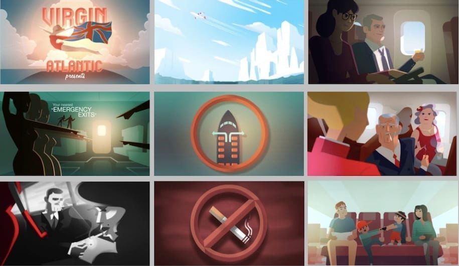
Just as the passengers are about to set off we wanted to take them on a little journey of our very own. Mirroring the usual apathy toward safety messages we looked to created a surprising and playful series of genre-based film scenes to convey all the necessary information. This approach felt inclusive to everyone and a nice way to pique the interest of all ages onboard.
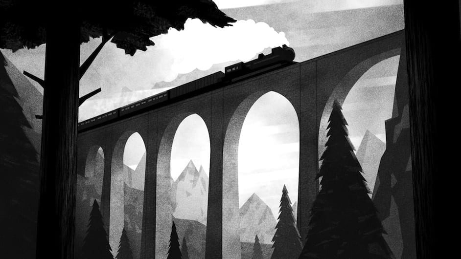
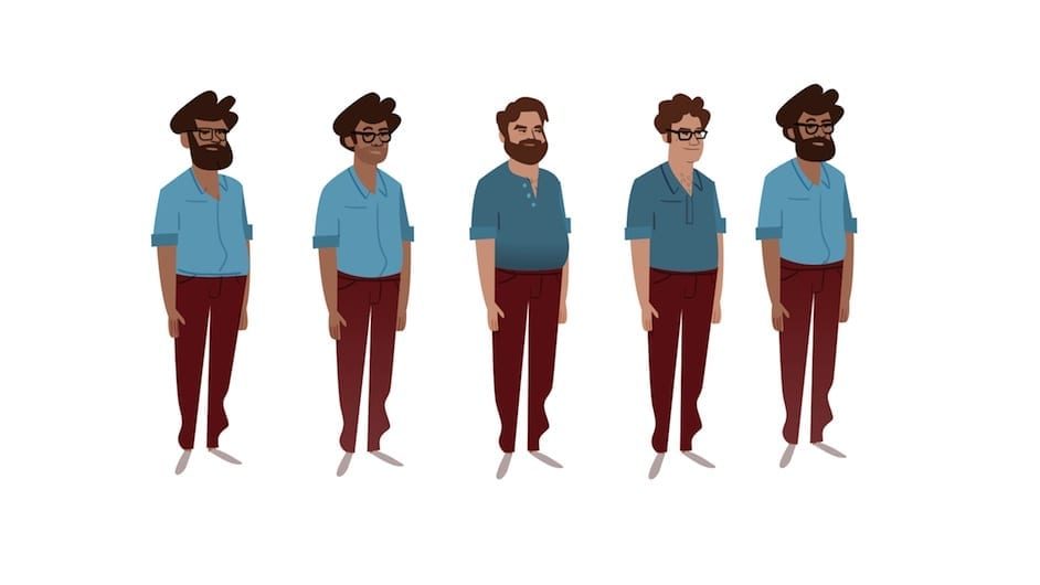
Quite early on we focused on representing the various Virgin Atlantic customers with a range of characters. Through beginning to develop this and various scenes we quickly came to the realisation that movie genres would provide a perfect setting. Film is a universal language and travelling with Virgin Atlantic can be like watching a good film; for those few hours on board you are transported into another world.
We’re all big film geeks in the studio, and doing a mini versions of all our favourite movie genres sounded like great fun from the start. It seemed to fit in nicely with Virgin Atlantic too, being known for their amazing range of onboard entertainment. After discussing various options, it also appeared that it was a rather inclusive concept: Everybody (or almost everybody) loves films, and can recognise some (maybe all) of the references.
The resulting pitch concept:
· Our film will be based on a timeless concept; classic film genres.
· Film is generationally, culturally expansive – we can all relate to and engage with film.
· Genres are constant; there’s always been a family comedy and they’re still making film noir today
· Film offers escapism, which is what Virgin offers its customers. When you get on a Virgin Atlantic plane you’re stepping into another world of glamour and quality.
· Combining luxurious imagery with humorous and elegant narratives
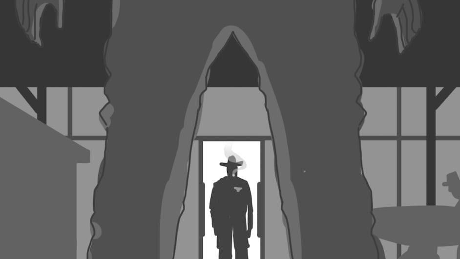
· Each section of the safety film will be a different genre, which will engage an audience
· The design and illustrative style were both clear, informative, textured and of course beautifully designed
Leon Trigg, Production Manager at Virgin Atlantic, said: “We approached several well-established animation studios and agencies but Art & Graft carefully considered the brief and understood our brand, who we are, and what our passengers expect from us. They pitched an exciting concept with a style that managed to convey warmth and familiarity, whilst feeling fresh, edgy and contemporary.”
Were there any great ideas that were shelved?
At one stage it was planned that an animation of the man himself, Richard Branson, would appear in the film as a roaring lion in a parody to the classic MGM film opening, golden mane and all! The idea was ran past Richard who was game though, though unfortunately the MGM lawyers didn’t see the funny side and vetoed the idea. If you look closely though, there’s a subtle representation of Richard Branson in the final psychedelic scene.
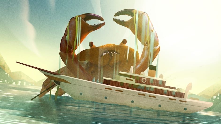
The crab in the B-movie scene utilises photographic elements – our little homage to Ray Harryhausen.
Were there other styles of animation that were debated about before deciding on the final method?
The previous film had such an extended run we were keen to develop a stylistic approach that was best equipped to stand the test of time, combining traditional character animation with more contemporary 3D techniques, to create a warm and approachable final film.
This approach adds a whole load of character to the final animation and allowed us to adapt the look and feel to match each particular film genre whilst keeping a strong visual theme throughout.
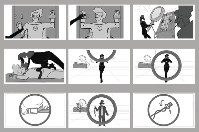
Could you tell us please about the creative process – were initial ideas sketched out on paper and then executed digitally?
To bring our ideas to life, the A&G team combined an illustrative approach with exciting 3D & 2D animation techniques.
All the character animation was produced using a traditional frame-by-frame technique – very labour intensive, especially when creating a six-minute film, but the results look beautiful and are extremely rewarding!
Elements throughout the film were modeled in 3D; allowing us to ’wrap’ our illustrations around these models to keep the illustrative feel yet giving the scenes fantastic depth and space. This allowed all the camera angles to be planned out and ensure the 2D characters could then be animated in each scene with the addition of further textures and casted shadows.
This approach also allowed the camera to travel around and through the scenes, giving a rich & filmic feel to the animation.
What were the main challenges of the production and how did you overcome then?
The budget was a little limited for an animated film of this length so we had to continually box-clever throughout the process as well as strive to create the best standard of film we were all capable of. We threw everything but the kitchen sink at it and the whole Art & Graft team were heroic in their efforts.
The animation approach we used can be painfully laborious sometimes and it takes a fair amount of dedication and teamwork to keep it going over an extended period of time.
We set ourselves quite a challenge and I think everyone involved should be extremely proud of what we’ve all achieved. The proof, as they say, is in the pudding… and it becomes a little difficult for us to judge, especially after staring at it for such a long time, so we’re over the moon that it’s getting such a positive response.
