Did you work with St Vincent on the visual narrative of the video? As the lyrics are not exactly linear with a clear-cut storyline, what was the starting point for your treatment?
I generally don’t pay a massive amount of attention to lyrics, but more to the tone the music evokes, what I imagine the artist’s personality to be, the vibe of the album and of course to the brief that the label or the commissioner sent…
In this case the label/management sent some visual references and I could see that they wanted to depart from the previous videos and I had the feeling that they were looking for something more graphic, more futuristic. Among them there was a link to Ryan Trecartin, an artist I really like, and they were mentioning things like “Technoparanoia” and “the contemporary unease of our modern world”. All things that I felt were right up my street.
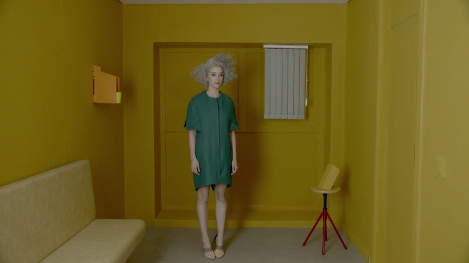
I then tried to forget all of that and come up with something original and the idea of creating a colourful geometric simplified world came along. I sent it over and luckily they liked it.
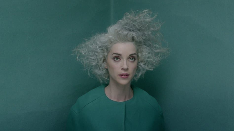
Wow, Annie Clark’s hair! Love it. Was it styled specifically to fit in with the video?
She came with the colour. I think she’d just dyed her hair for the promo stills of the new album, as part of this new stage of her career and the more graphic shape was added to fit the video.
How did you choreograph the movements – was everything storyboarded in detail to keep the timing and pace? Did the film flow naturally in the edit or was there a lot of rearranging?
We didn’t have much time to prep, so there was no time at all to storyboard. What I did was allocate each location to a different section of the song and then find movements with the characters that would fit the pace of those specific sections, so the movements are pretty much all in camera at normal speed. Pablo, the editor, didn’t really change the speed of any of the shots, but he masterfully synched all of the movements to the beat.
What were the main challenges of creating the film and how did you resolve them?
There were a lot of challenges. I think more than on any other music video I’ve directed before. First of all there was the fact that I sent a very ambitious treatment that was way more expensive than the actual budget, the typical mistake we directors make when we pitch for a video. We initially budgeted the project in LA and London, but the numbers weren’t fitting at all, so I decided to call Ilduara, a producer and good friend from Madrid, to make a budget. And somehow she managed to make it fit, after pulling endless favours.
So we then decided to shoot it in Madrid, where I am from, but where I haven’t lived for almost 10 years… And the project got signed off on a Monday at noon and we had to shoot it the next Sunday… So I got on the first flight to Madrid and stayed up till 4 am looking for locations on Google Earth, not having a clue where to find the type of places I had suggested in my treatment.
I woke up without any location in mind, but as I drove around industrial parks with the producer and the set designer, we decided to try some newly built neighborhoods and we found a few places that we absolutely loved, plus a water treatment plant that we spotted as we were driving on the freeway where we ended up shooting a couple of the exteriors and built all the interiors.
Another big challenge was to cover six outdoor locations – using a basic motion control rig in some of them – on the shortest day of the year, the 22nd of December, but somehow thanks to the DoP Pau’s idea of using two Alexas simultaneously we managed to make it all in time.
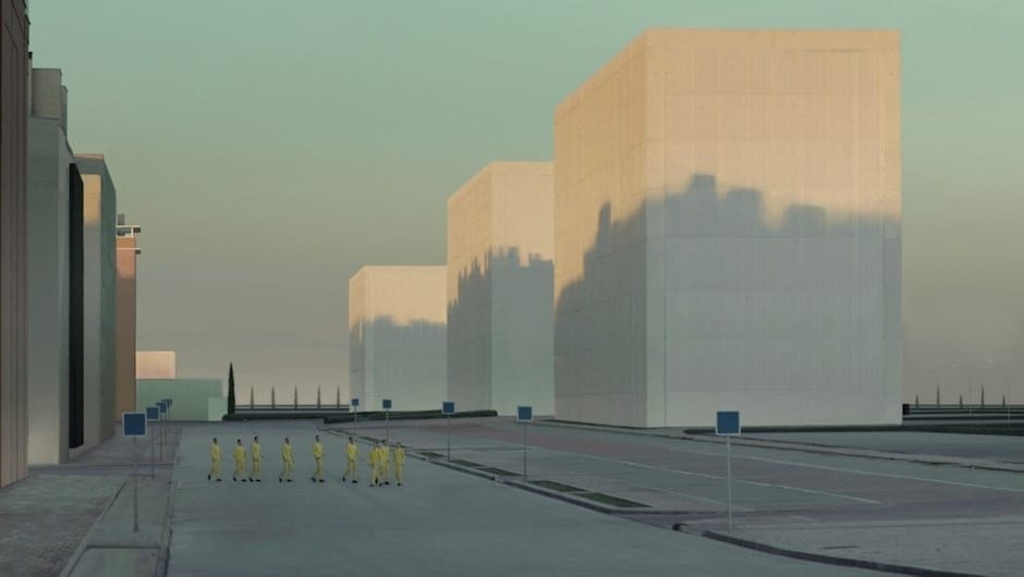
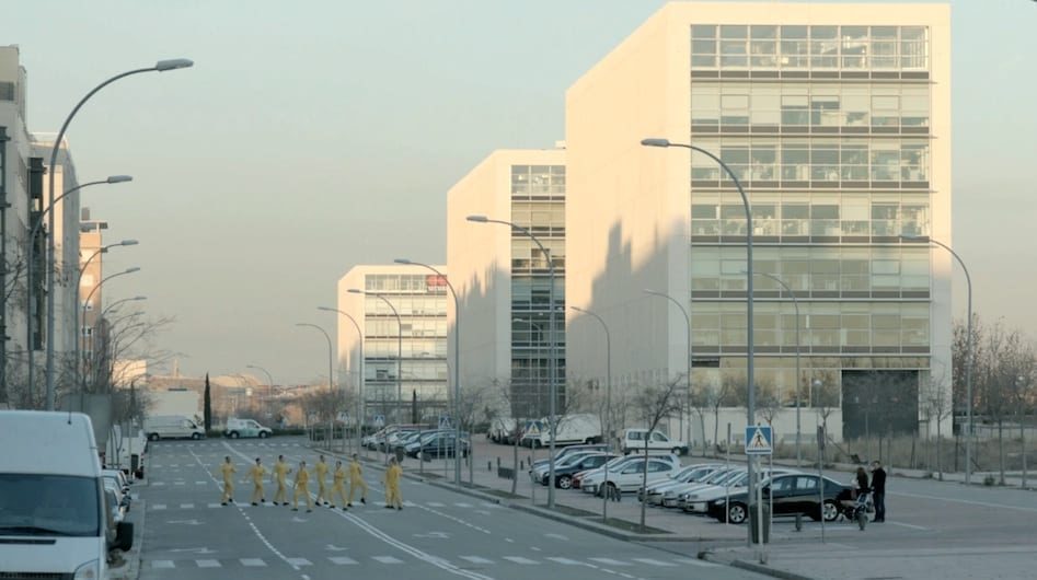
Once the shoot was finished the next massive challenge was to turn some rather normal streets into the set up of a futuristic world. For that User T38, a Madrid posthouse, spent four weeks altering the shots, removing cars, trees, pedestrians, windows, road signs, plus adding a few extra buildings and structures until we finally got what we wanted. Definitely not an easy task with all the time and budget constraints we had. (See in Related Content for post stills).
What inspired the colour palette? Were the colours graded significantly or were they in situ?
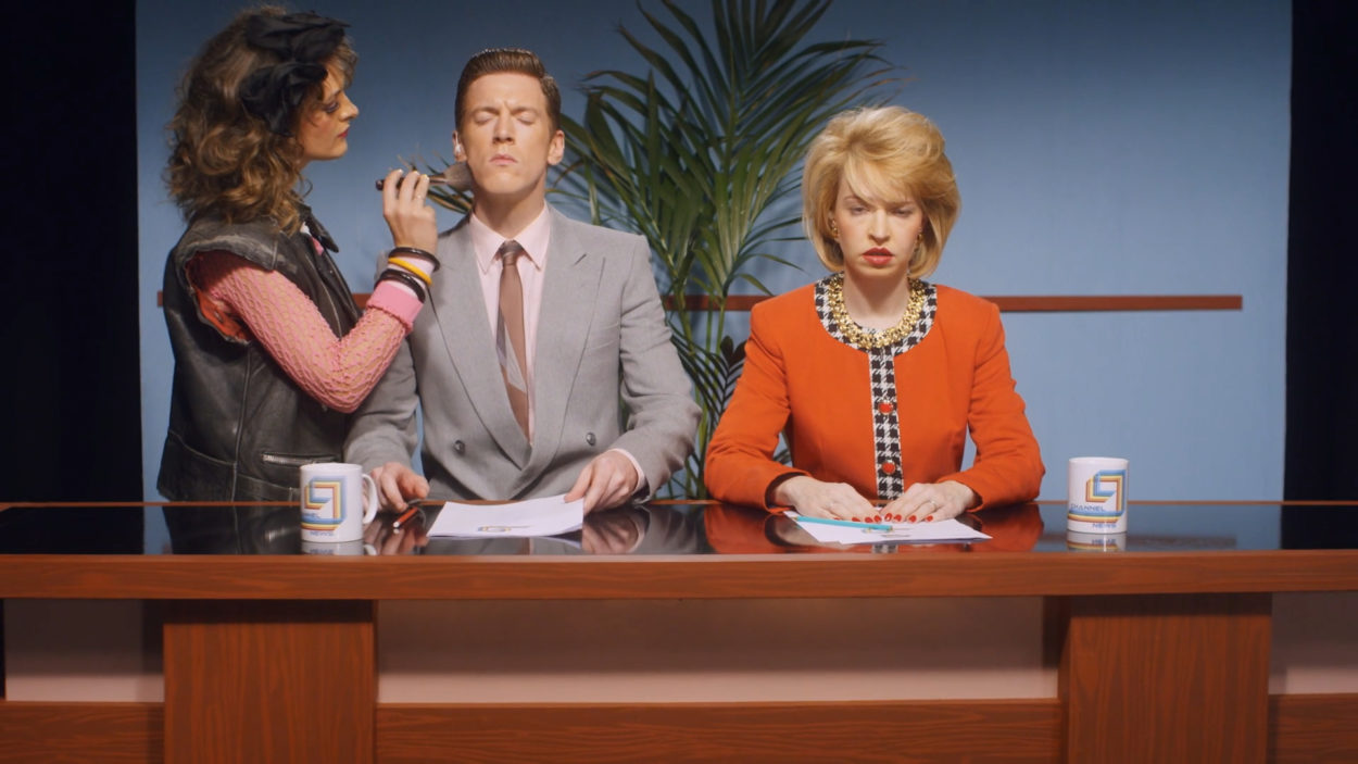
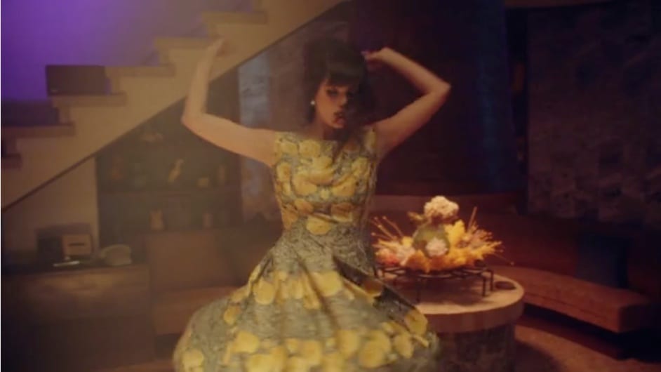
The colour palette was a very important aspect of the video. I was imagining a world made out of blues, yellows and greens against the grey background of a city made out of concrete. Not sure where the idea came from, but that’s what somehow felt right for the parallel reality I had in mind. Stephane, the art director, created all the interiors himself and Maria Elena, the stylist, got all the costumes made, except for Annie’s one, in order to have full control over the colour palette. Regarding the exteriors, we were lucky to find some buildings that had the colours we wanted except for one of them, which was altered in post.
