The following excerpt is taken from Roland Mouret’s site and your film seems to have captured this essence with an intense beauty:
Mouret was born in Lourdes, France. His mother worked in a hotel as a waitress and his father was a butcher. He first learned about fabric while working in his father’s shop, watching the folding of the butcher’s apron and learning to fold it to reveal a clean aspect, seeing the pattern of the blood on the white linen. He learned to cut from watching the way the skin of an animal is sectioned and divided with the knife. A confidence, a directness and boldness, informed his aesthetic and his approach defined by these early memories.
How did the idea for your film portraying Roland Mouret as young boy come about?
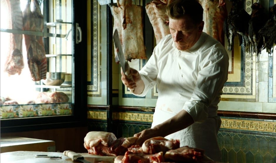
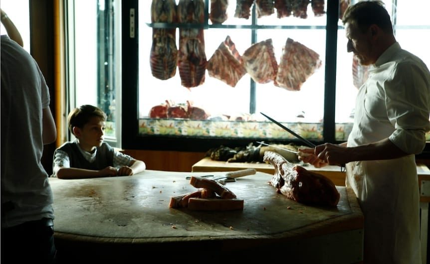
After spending time with Roland the significance of the relationship with his father became very clear. I found it fascinating that what Roland had observed as a child had so heavily influenced his unique style of cutting and folding fabric as a designer, so the idea of memory and the present, and the specific technique his father used when folding his apron were all concepts I wanted to develop. I loved the idea of the visceral, blood stained setting of a butcher shop connecting directly to the glossy world of contemporary high fashion.
I also was aware that such imagery had been used before in fashion, but mostly to shock or provoke. I wanted to shoot both worlds to be as equally beautiful.
One of Roland’s few requests from the inception of the project was NOT to make anything that may resemble what people would probably expect from a Mouret ‘fashion film’, so I felt that the father and son story should form the heart of the film. I knew that Roland had bought into the concept when he gave me his father’s actual apron to use in the film.
Throughout the process above all else I had to stay true to his story.
It’s a fashion film but only has one shot of a woman wearing one of Mouret’s structured dresses. Was this always the intention to show only the refined connection between his design and memory?
The script was always weighted pretty evenly between the butcher shop scene and images of a “woman in a dress”.
It was pretty early into the edit that we (Edward Line, editor, and myself) just felt “less was more” in terms the ‘fashion’ images. There was definitely a fine line between creating something we could see was fresh within the genre and had a real emotional connection to the designer himself and adding imagery just so we could more easily label it as a ‘fashion film’.
It was important for me that fashion elements we did use still somehow felt connected intrinsically to the butchers scene, so we chose images of the woman that were maybe less ‘fashion’ and more dark and unsettling, without ever resorting to shock tactics.
We’re a great fan of Steve Annis, your DoP on this project and the lighting, framing and pace on Titane Lune is exquisite. How did the collaboration work? What process did you go through to work out the tone and feel?
I had wanted to work with Steve for a while and loved what he was doing on music videos for directors such as Aoife McArdle and Vincent Haycock, and could see how he could bring something amazing to this project, and so pretty much from the start I knew that by hook or by crook I had to have him! It was a really big deal for me then when he said he loved the treatment and was in…
The first thing we did was to just chat about the idea and the vibe we wanted to convey with the images, luckily I think we were coming from the same place pretty much from the off.
The script had a mix of ethereal, classic beauty and dark surreal elements, and so after we had visited the two locations, both of which I have to say we couldn’t have hoped to have found more beautiful and perfect versions of, we knew what we wanted to do with lighting, and how we wanted to frame the shots within each of the very different spaces. I’d like to say it was weeks in planning and endless conversations, but it was much easier than that!
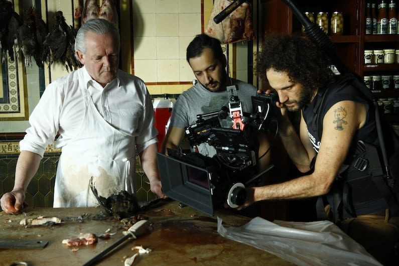
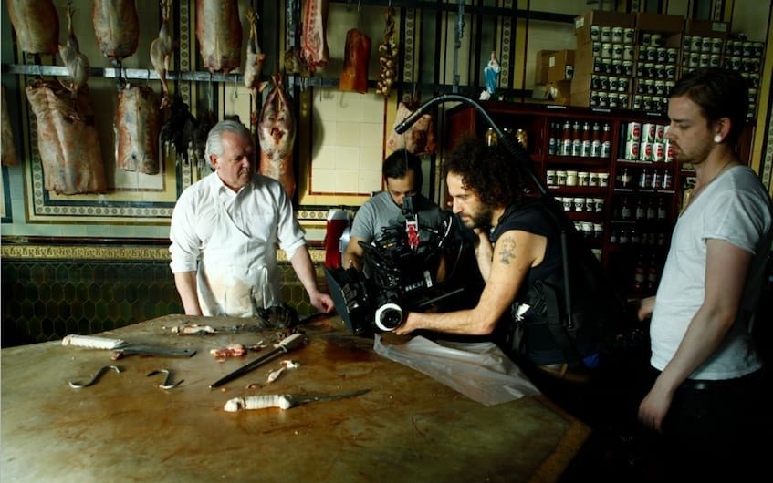
In terms of the overall look of the piece first and foremost we both agreed that it should feel cinematic, so shooting on anamorphic lenses was non-negotiable, as was my desire for various tracking shots in both locations. Steve can do magic with his easy-rig and a Red Epic, so handheld for the most part was always going to be the way we worked on this one. The great thing about Steve, apart from him being a wonderful person, is the way he spots the beauty in everything and is able to capture it in each frame. It was important that I allowed him time to do his thing, and to a large extent the images that he got with this freedom influenced the pace and structure of the film.
Did you storyboard the film – were there any scenes that didn’t make the final edit?
There was a thumbnail storyboard that I did for myself only, but I worked mainly from a shot list and detailed notes. I tend to use storyboards for commercials or technical shoots, as that is what is required for the process. I had a tight structure to the day, but I also wanted to give Steve, the actors and myself the freedom to deviate within that, where a storyboard may have tied us into a more predetermined course.
It was much more of a narrative (albeit surreal) piece going into the shoot, and we shot several scenes which included an unidentified man bleeding to death on the floor of the butcher shop (big thank you to all at MUNKY for their work in flame painting him out in a couple of the shots!), and an older teenage Roland wearing his father’s blood stained apron in the mansion – all very Kubrick inspired weirdness!
But however intriguing, surreal, beautiful these images were it became clear to Ed and myself in the edit that these additional visual and narrative elements were superfluous and actually got in the way of the core (if still slightly surreal) story of the boy observing his father, playing against the images of a woman in a Mouret dress a very different place and time.
What were the main challenges of creating the film and how did you resolve them?
Other than the inevitable issues that arise from shooting with a very little budget at the weekend (we only had access to both locations on a Sunday) in a twelve-hour day with a location move, I’d say casting was the biggest challenge.
It was important that the actor playing the role of the butcher could convincingly cut and chop meat – without fear that he might cut a finger off in the process. At one point it looked like we’d have to find a real butcher and hope he could pull off the acting bit, which filled me with terror. My prayers were answered when mega casting agent Jina Jay suggested Geoff Bell, who not only had the perfect look and was great actor he had played a butcher previously in the movie “Girl with a Pearl Earing”!
I was equally steadfast in my desire to find an actual French boy in London. Easier said than done! But again we struck gold with little Pierre, surely the cutest and nicest French kid in the world.
Finally I found Leanne Best, who had the perfect blend of strength and vulnerability, on stage in London, in a tour de force solo performance of “The Matchbox”. Once the cast was in place it was relatively plain sailing.
See in Related Content for production stills
