Do your short films inform your direction of commercials and vice versa? When you’re not shooting commercials are you always working on personal projects?
Our short films keep our creative work fresh. Each time we make a short film it pushes us, allowing us to try out new visual ideas and express our own creative voice. We have always had personal projects that we dip into between commercials. They are great fun to work on and keep us creatively focused.
How does your creative process work as a team – do you both have a similar skill set and work together on each aspect of film making or do you have clearly defined roles? Do you have turns at being captain – perhaps one comes up with an idea and the other assists?
We share all aspects of the film making process whether, it be in story development, writing, pre-production, the shoot or post.
How did the idea evolve – my understanding of the narrative is about how we can project a lifetime of potential in a glance upon meeting someone but that connection can so easily be lost?
We wanted to create a simple idea that was photographically beautiful with memorable characters that had true emotional depth. This is a challenging ambition for a short film, as you have next to no time to create a character’s history. Our solution was to create a history between a couple that has not happened yet or indeed may never happen at all.
Our approach was to use location, tone, colour and performance to express the different key moments from a potential relationship. Each element would help tell and support the story telling.
The marsh is the early ‘getting to know you’ stage of a relationship – that’s why we chose a natural, Gaussian environment to give it a tactility and lightness that reflects the beginning point of the relationship.
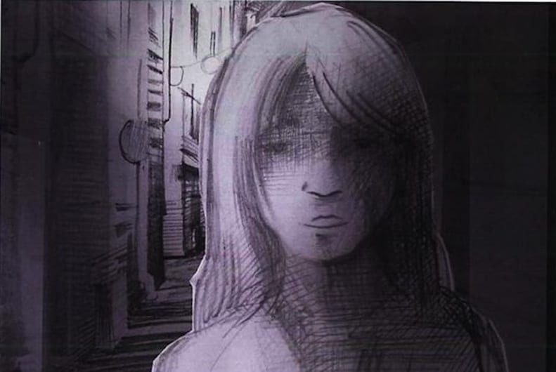
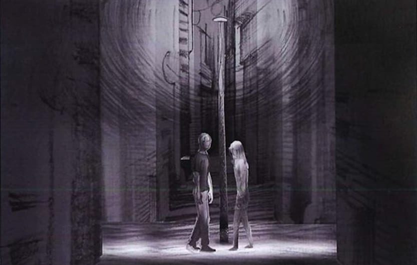
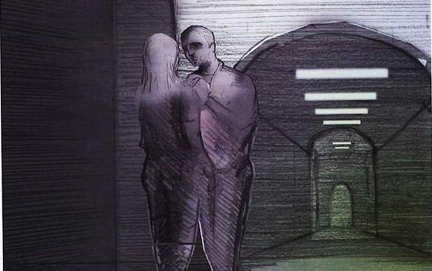
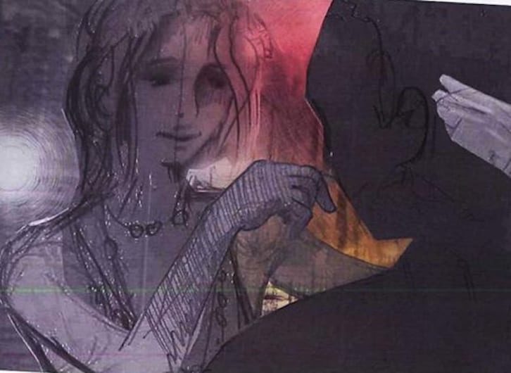
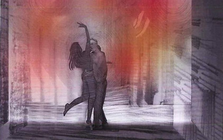
The back alley is urban, raw and neon coloured to give it a synthetic feel more evocative and sexualized to represent the ‘fun and games’ of a relationship.
The hospital scene is internal, cold and confined to enhance the idea of ‘need and support’ that the couple are sharing at that moment. Every element was considered and planned.
Your interpretation works well, but what we are finding interesting is that ‘Glance’ seems to reflect the different experiences of those who view it and so people are having different emotional responses to the film.
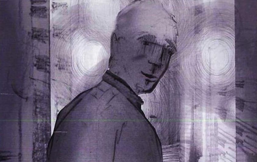
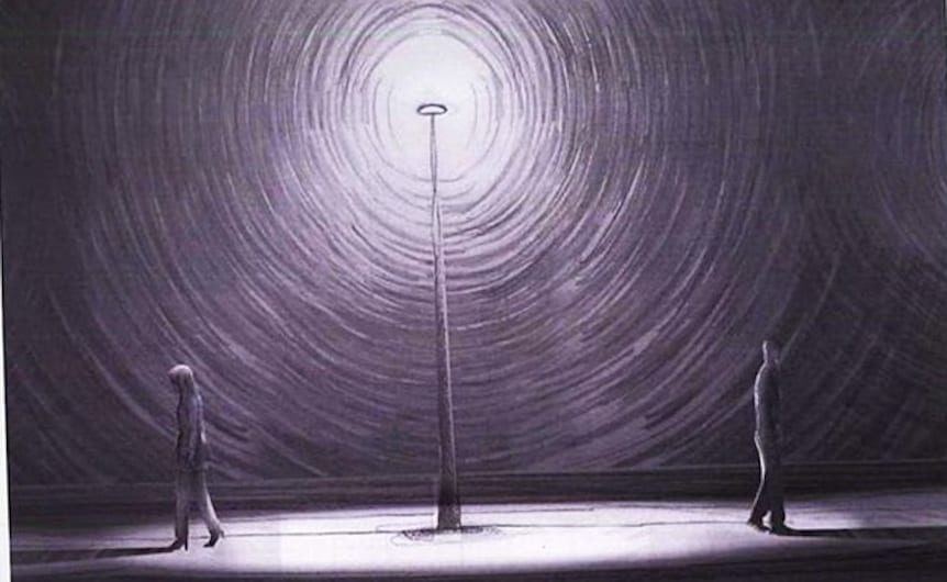
Did you draw up a storyboard or did the film evolve with a shots list on location? And where did you shoot it – were all locations within striking distance of each other?
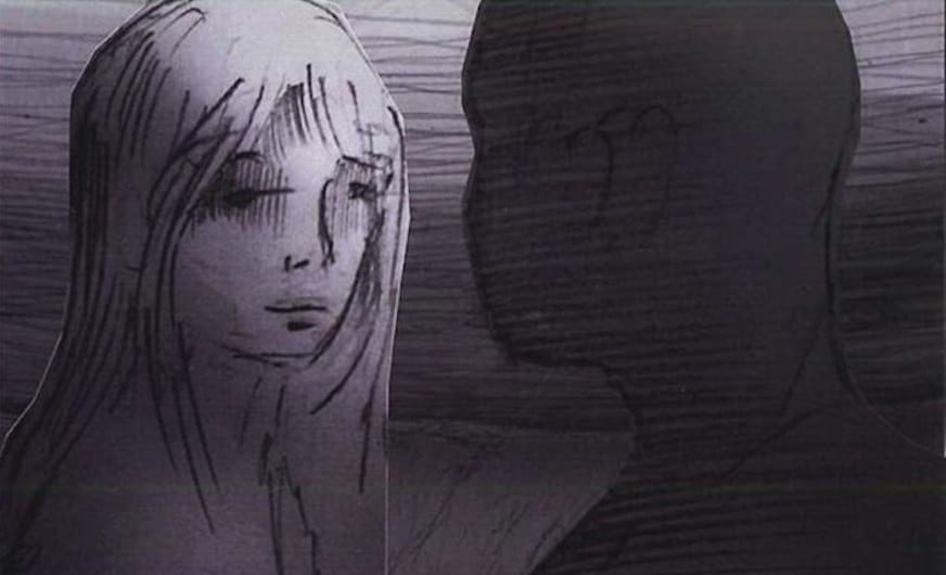
We needed a storyboard and a substantial shot list – a subtle but key element to the success of the film is the fluid choreography that runs through each scene. For example the action in the marsh where the boy takes the moth from the girls jumper was repeated in each location with a different motivation. In the alleyway he held a pendant from a necklace that hung around her neck and in the hospital he placed his hand on her chest. This choreography gave us a structure to work to when it came to the edit, and helps make the simple linear story of a couple passing each other flow.
In addition to this choreography and key performance points, we left enough space for the actors to explore each moment and occasionally improvise.
The street scene was shot in Dagenham – only a couple of miles away from Rainham Marshes where we shot the marsh scene, whereas the alleyway was shot in Berners Mews and the hospital scene was in Kensington.
The lighting plays an important part of the visual language – were there certain creative conversations you had with the DoP to achieve this?
We had a very strong idea of what we wanted to achieve with the lighting as it plays the third character in the film. We designed the lighting with our DoP Ben Magahy and art director Laurence Dorman. We visited each location with a minimal lighting rig and photographed it extensively, so we were prepared and happy with each scene before the shoot day.
Did you set the film to a published track or was it an original score?
The elegant piano score is called ‘Threnody’, written and performed by Goldmund, one of the musical monikers of Keith Kenniff. It was really the only choice, as listening to it inspired the initial concept for the film.
What were the most challenging aspects of the shoot / production?
Time and money!
A lot of your earlier work has an animation or VFX element to it. Were there any VFX used in Glance or was it entirely live action shot in camera?
VFX is used in Glance but it is handled with a very light touch. The moth is CG and the lamppost was originally half its height – this was due to the limitations of transporting a lamppost and location restrictions.
The wide shot in the hospital scene is a particular VFX highlight as it was created from various plates to give us an impossibly wide view of the location. We still enjoy using VFX, but we prefer it to be ‘invisible’ if the story doesn’t require it.
What are you working on now?
Other than various commercial projects, we have a very exciting idea based on dynamic motion that we hope to see realised in the next year.
See more of Conkerco’s short films and a selection taken from the storyboard for Glance in Related Content
LINKS:

