We love your new title sequence for OFFF Lille which Brikk has done with fellow Swedish company Snask. Totally bananas. Can you tell us about creating the titles please – what were the main challenges, did you have to scour miles of stock footage? Was it all easy going or a headache to do?
We had a lot of fun doing the titles for OFFF. And of course it gave us a few headaches too. I think we were just as confused doing this as the viewers felt watching it. But that was sort of the whole point.
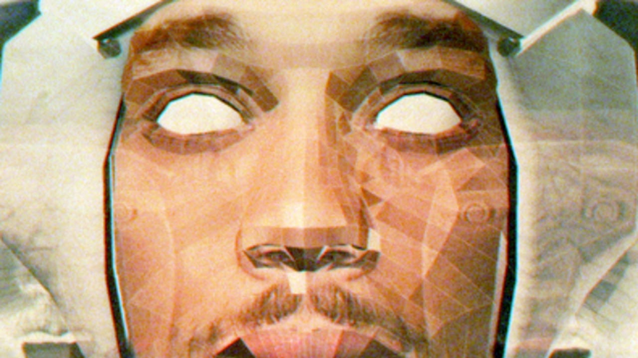
Our friends from Snask came to us with this project, about two and a half weeks before the deadline. We were all very aware of the high quality of OFFF’s earlier titles, when it came to design as well as the animation. So our thoughts were – ‘we can’t make three minutes of groundbreaking motion graphics in two weeks. So let’s do something really stupid and funny instead.’ We decided that it didn’t have to make sense at all. Just keep a fast pace and a lot of awesome action. We laughed all the time making this. And luckily the result was better than we could imagine.
The first step was to find a really good environment. A location that looked great even before post-production. Fredrik from Snask knew this weird place called Dragon Gate outside Gävle (a small town in Sweden).
It’s basically a huge Chinese looking square in the middle of nowhere. There is a hotel (that’s not open) and a huge Buddha statue. So we got some costumes, some fake guns and just went there. There was sort of a script that made no sense of course. We spent half a day filming in the blistering cold Swedish weather. We decided that we wouldn’t do any second takes. Just shoot all the stupid things we could come up with in one take.
Brikk got the confusing task of editing it, trying to make some sort of sense of all the chaotic clips. Brikk also did the post-production, created the dirty 70s look and the special effects.
Getting the look we wanted was a lot of fun. We used tons of weird clips and effects to destroy the RED material. For example, one blending layer was a broken video game screen, just flickering in a nice way that one of us had filmed in a bar. We try to collect stuff like this all the time.
Snask’s designer Magdalena Czarnecki created the great looking logotypes that we then animated. Early in the process we also involved the talented Joel Andersson in creating the sound and music. We used some stock footage, two or three clips I think.
Could you tell us please how Brikk works? Is it a collective – we like Swedish collectives – is it a production company, although we can’t see a roster of directors, or is it an animation house?
Brikk as a concept is a production company, animation studio and a creative collective. The main constellation consists of three directors (who are also designers and animators); Josef Andersson, Samuel Fast and Björn Johansson. The three of us met when we studied graphic design and illustration at Konstfack, University College of Arts, Crafts and Design in Stockholm, Sweden. We graduated 2009/10.
We share a hands-on approach to what we do. Probably because we all love variety in the creative process, we all take part in the steps of making our animation from start to finish, regardless if it’s writing scripts, illustrating, experimenting with ink and paper or animating.
Then we have the Brikk office which is another story. We handpicked some of Sweden’s finest designers, illustrators, photographers and motion designers – who also happen to be good friends – to join forces in our office.
We collaborate with these talented creatives on many projects so in that sense we are very much like a creative collective as well.
Inspired by the OFFF titles we cruised through your website and discovered you have an entire music video department that we didn’t know about. We think the world should know about these too. These are the ones that we love so far (see Related Content). Can you tell us please about these and how does your music video creative process work?
We approach every video request the same way we do with all of our work – as an opportunity to try something completely new. We listen to the music and reflect over the lyrics and the general mood of the song. Most often we already have a lot of visual ideas we’d like to try out. Sometimes we look for inspiration in illustrations, photos, graphic design or films.
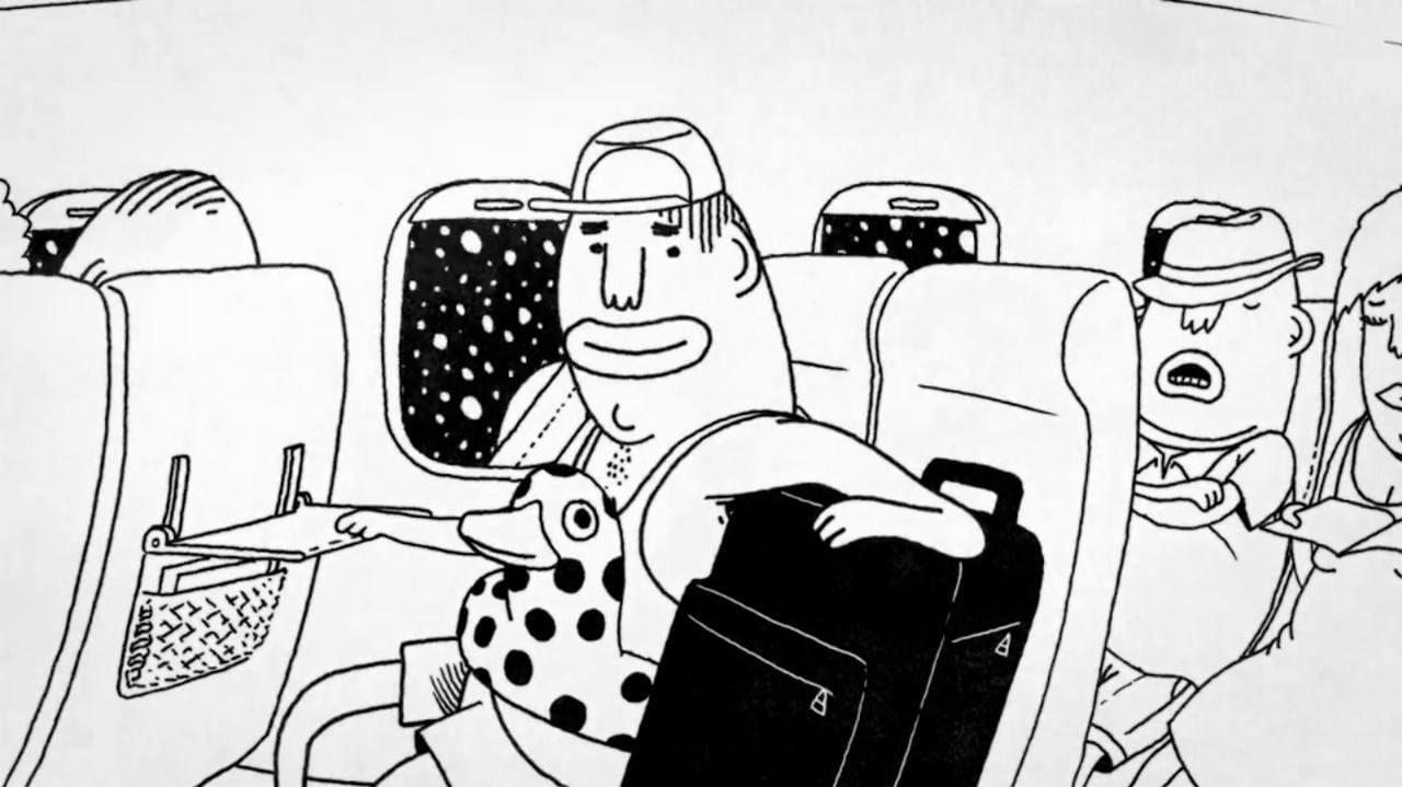
Stormakten, Söderut:
For our friends in the band Stormakten, we did this music video for their song Söderut. Since we did it pro bono, we were given free reign to do whatever we pleased.
“Söderut” roughly translates to “traveling south”, and is an escapist indie pop anthem about dreaming yourself away from loneliness, as the last song is played on the dance floor.
Our take on the song was to interpret the title literally, instead of picking up on the vulnerability conveyed by the lyrics, thus creating a somewhat comic effect. The video is about the typical douche bag traveling south (to Thailand most likely), for the sole purpose of getting wasted on drugs and alcohol, and being a total menace to everyone he meets. We had a lot of fun coming up with the ideas for it, and we tried not to censure ourselves. The biggest discussion when making the video was whether or not the main character would be punished for his lewd behavior in the end, and if you watch the video you’ll get a hint of what we finally decided.
Gustaf Öhrnell, an awesome illustrator who also has a desk at the Brikk office, did all the nice drawings for the video. He was also the co-director together with Brikk.
Marcus Price & Carli, Big Room Skiten:
Marcus Price and Carli actually came to us with a clear vision of what they wanted. They gave us a rave video from the 90s as a reference. The guys wanted us to put them in tiny 3D spaceships traveling around the globe in high speed. We soon realized that those clips wouldn’t be enough and added the old stock video clips and mashed everything up in a lovely mess.
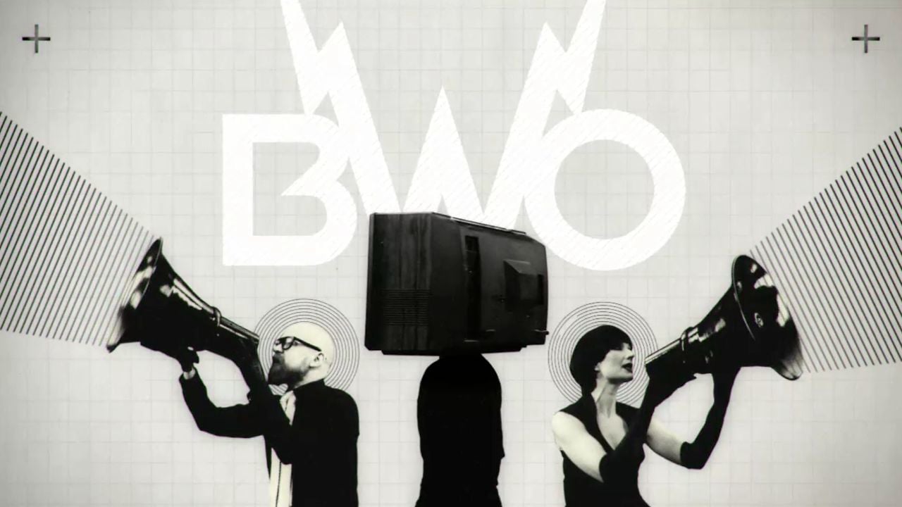
BWO, Right Here Right Now:
All of us really love modernist graphic design and art from the 1950s. We thought it would be fun to try to apply that style in a video. We filmed the band in front of a green screen in several angles, and on a spinning board.
Then we put the whole thing together in After Effects with the graphics we’d made.
A funny detail is the old TV on their heads. We actually used a real one and put it on a stool on the spinning board. Then masked the screen out and used its real reflections as a blending layer.
Timbuktu, N.A.P:
This is actually one of our first videos. We made this during our second year at Konstfack, it was a lot about experimenting with combining filmed material and animation. We illustrated all environments, characters and the car in illustrator. Then added textures in Photoshop.
The song itself is about how people in general don’t care about anyone else’s problems other than their own. So we thought it would be fun to make a one-man band, driving through these weird horrible accidents just minding his own business. Finally these small coincidences result in the whole city blowing up. Many a mickle makes a muckle or something like that…
Showreel:
The best of the best!

