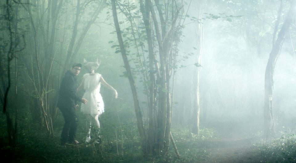
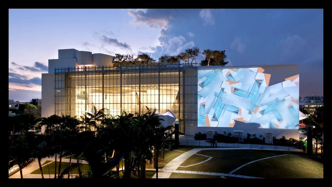
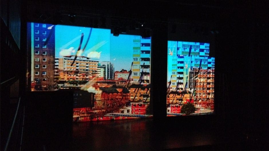
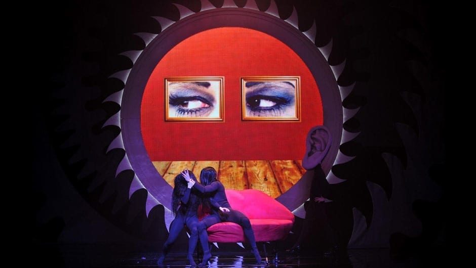
Having created a site-specific digital mural for the new Frank Gehry-designed New World Center in Miami and massive digital visuals for a ballet at Sadlers Wells with music by the Pet Shop Boys earlier this year, video artist Tal Rosner (pictured above on location) has now co-directed his first music video with Lance Roehrig. 1.4 catches up with Tal in London to talk about the promo, STRANGE, for musician Leigh de Vries.
See more installation work and videos by Tal Rosner in Related Content.
Have you previously collaborated with Leigh de Vries?
STRANGE is the first track to be released from the new album by of industrial rock artist Leigh de Vries. I met Leigh back in 2005 on the London clubbing scene and over the years we became close friends and collaborators. In addition for being my muse for Family Tree, a seven-channel video installation (Tendepixel Gallery, 2009) and a great partner in crime for brainstorming work and life in general, she has impressed me with her strikingly unique and independent vision, as well as her insatiable hunger for the new.
How did you evolve the narrative for the video?
Like Leigh herself, STRANGE is fierce, original and extremely inventive. When approaching the video we knew we wanted to reflect the song’s futuristic/noir and trance-like tribal qualities, but at the same time keep the viewer engaged with its lyrics and the story-line. It had to make a distinctive fashion statement and it had to stand out. Along with the striking visual statement, it was highly important for me to add a level of meta-narrative, which manifested in a tailor-made grammatical language within the editing and the After Effect work. In this way, I aimed to create a ‘state of mind’, not in only ‘what’ you see but also in ‘how’ you see it (transitions between camera angles, and so on).
Making a music video is a new genre for you isn’t it?
For me, co-directing and editing a music promo was a challenging task, as the bigger part of my artistic practice to date has been in either creating title sequences for TV or in illustrating chamber or orchestral music for stage. Both genres do not tend to feature a singer or lyrics and are very different in length (either 30 seconds for a title sequences or 20-30 mins for a stage piece). Nevertheless, I knew that STRANGE could be a great opportunity for me: firstly, it was an excuse to work with Leigh again, and secondly, it gave me the artistic freedom to demonstrate my skills in the world of music promos – a genre that has always inspired me.
Tell us about the process of making it.
The making of STRANGE started a year and a half ago, when Leigh assembled an exciting cohort of (mostly) London-based designers to create the various ‘worlds’ for her video. From the pre-production stage it was clear how much thought had gone into all of the elements. There was a rich mix of locations (indoors and outdoors), costumes and make up, and a fantastic narrative in which Leigh plays multiple characters in a tale of love, death and resurrection.
The shoot was co-directed by Lance Roehrig, who came along with great expertise and experience in film language. Producer Alexander Hold, DoP Arron Reid (who shot on RED) and stylist Victor Velvet also added to a hard-edged creative team who worked in close collaboration over the three days of filming in both north and south London. In addition, choreographer Cameron McMillan (who I had worked with before) came in to develop a dynamic physical language and pace with Leigh and the two gorgeous minions, Foxy and Matthew.
For me, in a way, the long journey of STRANGE began only when the filming ended and I was left with a significant amount of footage to create the video. I wanted it to use the existing rules of music promo dialect, and at the same time offer a fresh twist on traditional editing grammar. The idea to introduce a kind of architectural disturbance to the frames in the edit came from my other strands of work, which are usually more abstract and often use elements from buildings that are then multiplied and transformed to create new patterns and textures on-screen.
Naturally, the outfits and scenarios dictated certain moods – which had to, in turn, interact with each other. I wanted to keep the focus on Leigh and the minions, but to also have a more understated layer of ‘glitches’ in the background, manifesting the warp in which the characters are in, without distracting from the foreground, where the action takes place. Shooting on a RED at a little over 4000pix wide and editing in HD allowed a very fluid play with re-cropping, rotating and re-arranging frames, as well as re-tilting/panning within each existing frame.
Tell us about your project for the Frank Gehry New World Center in Miami.
In 2011 I was commissioned to create a large scale permanent installation on the facade the New World Symphony, a new Frank Gehry-designed concert hall in Miami Beach. For the project I joined forces with the incredible LA-based designer and programmer Casey Reas, and the result was Chronograph: an endless clock-based digital mural, which changes every hour on the hour and every day, never repeating itself. The building blocks of Chronograph were again, elements of local Art-deco architecture as well as building materials from the construction of the hall.
I guess I am very much interested in abstraction and construction/reconstruction, in how we perceive an image and how it is framed. Because my work often showcases the process itself, I am always happy to show the edges of the original source material, giving the viewer an insight to the editing process and thereby involving them in the assembly of the final piece.
What particular programs do you create your work with?
After Effects is a great tool that I used on STRANGE and in my work in general. The fact that it allows Photoshop-based thinking with multiple layers (at the same time) and transition modes/overlay that can show various actions simultaneously is inherent to my practice. Also, the ability to combine vector slicing on footage or graphics and masking/matting of elements can be great tools to pre-empt the next scene or foresee what is going to happen, when dealing with multiple narratives. I like videos that you can experience more than once, in which each viewing gives you more and more information and not all is revealed in one go.
I find that motion graphics have a lot in common with dance. In the same way that choreography arranges bodies in space, I move, shift, rotate and ‘choreograph’ elements on a screen. I think there’s a huge and fascinating world to explore in the interaction between screen and stage.
