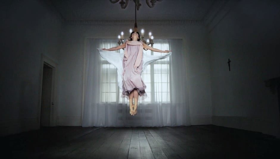
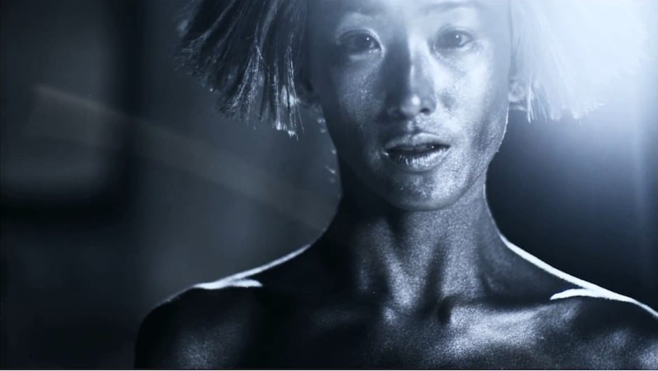
You’ve created an exquisitely art directed universe of “the duality of human identity; love / hate, black / white, life / death, light / dark, beginning / end”. Did you collaborate on the idea with Twenty6 magazine who commissioned you or were you given creative freedom?
Thank you! Yes, I was given creative freedom. The project originally developed over a few months, but it was a meeting between myself, stylist David Hawkins and Twenty6’s Tilly Hardy that brought all the elements together. Twenty6 have a specific font for each issue so the film had to utilise that – but other than that they were great in just encouraging us to do what we felt was right.
What was your creative process for evolving the idea and aesthetics of the film?
The concept developed from a multitude of ideas, over quite a long time. Some were visuals I’d had in mind for a long time which had nowhere to ‘live’ elsewhere. Some were ideas or shots I’d worked up for other things, never to use. Early on, myself and (Hungry Man MD) Matt Buels decided we wanted to create something which was purely an art film, and so I revisited some previously abandoned thoughts and concepts and this film kind of evolved from those.
Did you storyboard your script in detail or was there some spontaneous moments that happened on set?
It was semi-story-boarded. I had an overall narrative in mind, and a page of shot lists, ideas to try, and visual reference for each scene. A lot of the ideas came from working with Celeste Wong (the actress in the film) and Lucie Pankhurst (the choreographer) in rehearsal sessions – we worked through what Celeste could bring physically to the film and that kind of jigsawed into the story-telling elements. Snaps from rehearsals became the storyboard, in some cases.
Did you shoot on a high speed Phantom? Did you consider anything else?
The Phantom was key to the project in a number of ways. The whole project came together because of the team – which was largely people I’d worked with on commercials. Myself and Jason Berman (DOP and Phantom expert) had always talked of doing something non-commercial together so as this idea developed, it seemed like the perfect match. Plus some of the specific effects and ideas in the film really suited the use of the camera. So it all fitted beautifully. And Jason is great to work with, whatever the subject matter.
It looks as if every shot was very considered, especially with the post production. Tell us about that please.
Actually, as always with these sort of things, time and money were in short supply, so I would of course have loved to have much more time to consider everything! For instance I would have preferred to have time before the shoot to work out how we were going to achieve certain effects exactly.
Celeste plays both the ‘Bride’ and the ‘Widow’ characters, so there were times when the joining up of two performances were quite a challenge, post wise. But whatever I gave to Time Based Arts, they made it work, such is there skill! I’d worked with them before on a collaborative project with United Visual Artists, so I knew they could pull it off.
A large part of any film is, of course, sound. I’d met Robin Rimbaud (Scanner) on a previous job, and was really pleased when he wanted to be a part of this film, as I’ve been a fan of his work for some years. For me – Scanner brought the scenes (which are largely slow-motion and ethereal) to life – essentially replacing the use of dialogue with sound. The music and SFX blended to become a single piece, which I think works really nicely. As it should always be – the sound bed is a key part in the emotive storytelling.
We heard that you started as a graphic designer and moved onto making concert visuals for Jay-Z and Massive Attack. How would you describe your film style now?
Yes I was a designer / art director. I started work in London at Time Out magazine, then moved on to a company called Spin where I did a lot of television identity work for channel 4 and MTV and the like. I guess that design / art direction background has always stuck with me; I have a love of balance and symmetry (or a use of asymmetry when it’s relevant to the subject matter) and underlying guidelines.
The work I did for Massive Attack and Jay-Z was always through United Visual Artists; I love working with them because they bring a perfect balance of art, design and technology to their work. I don’t really think about my style as such – I think it just comes out the way it comes out… and that, in turn defines my style? Hmm…
Out of all your work what pieces are you most proud of and why?
I love working in all aspects of film and design, and I really enjoy the process of making commercials. But I suppose it’s work like this, and other self-moitvated projects that are ultimately most satisfying because they just wouldn’t exist if myself and a lot of other people hadn’t worked to create them. If I don’t shoot a commercial, someone else will, so it will always get ‘out there’ – but with this kind of film, it really feels like creating something from nothing, and I am pretty proud of that.
LINK:
Hungry Man
