To see the interactive video click here
What was the starting point for this idea?
I had wanted to create a video activated by movements for many years. I was just waiting for the right opportunity. Three years ago, I showed a little demo I did to Arcade Fire. Régine told me that there would probably be a dancy song on the upcoming album that could be a good fit with the idea. The song ended up to be Sprawl II!
Unlike previous interactive videos, the nature of the interaction is a lot ‘purer’ and elemental – it’s all about movement. Why was it important to you that the video was activated by dance?
I’ve been developing interactive videos for a while. I was thinking of ways to go beyond the mouse and the keyboard but still wanted a straightforward interactivity. The motion detection enables something visceral, primitive and almost magic since there is nothing visible between you and the piece. The motion detection has been around for a while. But I wanted to bridge the concept with something really cinematic. I also wanted to avoid the invisible interface à la Minority Report. With sprawl2.com, you move or dance as you want. It affects the pacing of the film and becomes something unique each time.
The song was inspired by the book Mountains Beyond Mountains – did that inform or inspire the video in any way?
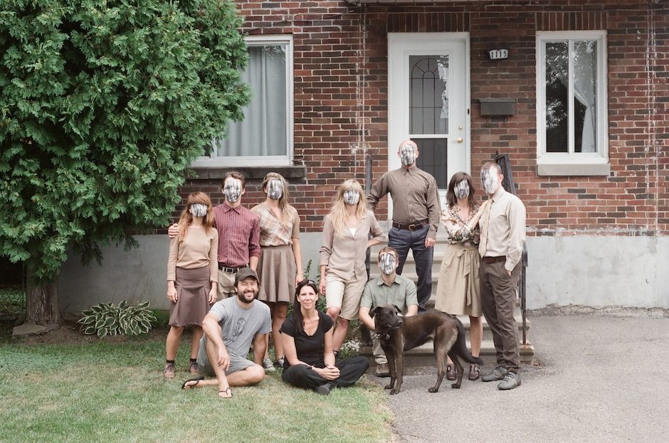
I read Mountains Beyond Mountains. It’s brillant and really really inspiring. Before the earthquake, the band was supposed to be in Jacmel for the carnival and it was possible that I join them to film. I think that Renata Morales, the art director, and I were mostly inspired by the Haitian carnival vibe that mixes grotesk, scary and festive stuff than by the journey of Paul Farmer for the video. I really recommend the book though. The band has been supporting Farmer’s organisation, Partners in Health. It’s really worth looking at what they do (https://www.pih.org). The papier maché heads were created by Vadi Confident in Haiti based on mugshots the band sent him… They are amazing and creepy!
In terms of the aesthetic, what were you aiming for?
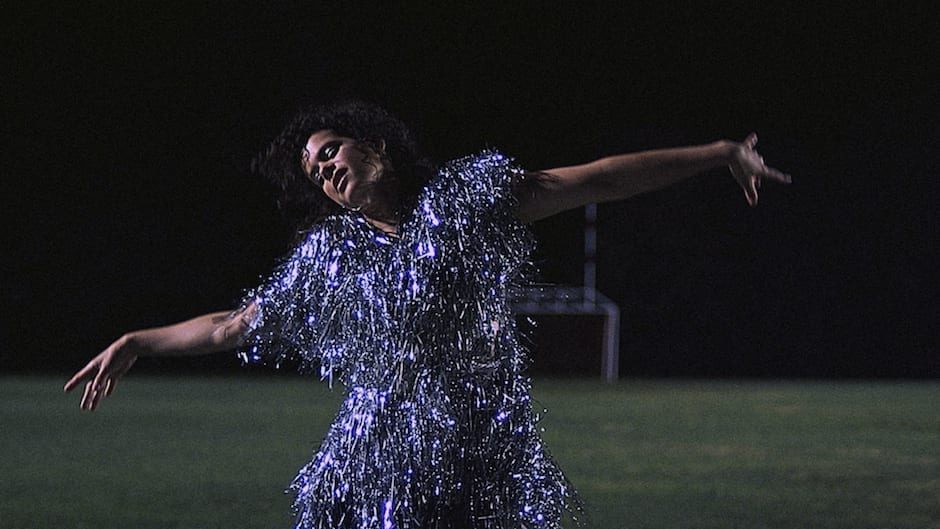
For “The Suburbs” cover, Gabriel Jones and I went to Houston’s suburbs to get images that would become the timeless suburban panorama with the eight different covers. I wanted to continue, with the video, what we had started to create with the static artwork. Régine and I grew up in Montreal suburbs. I was interested in this generic and familiar environment. There is something really natural in the settings. But the characters in it are surrealist. I liked that contrast. I gave carte blanche to Renata Morales for Régine’s costumes. She has been doing the band’s outfits forever and she’s crazy talented. She echoed my original intentions by creating a paper dress from which she metamorphoses into this bright orange phoenix with blinking lights. The song is about alienation and a desire to escape. We wanted to develop an aesthetic that would echo the lyrics…
Personally I felt there was something almost dream like about the experience – the repetition and odd characters who populate the video (faceless girl and sad-looking beige dress girl for example). What are your thoughts on the psychology of the video?
In the video, Régine escapes from her environment by day-dreaming. So we have one foot in reality and the other in a bizarre world. I think that the connection between the viewer’s movements and the actual film also adds to this surreal feeling. I remember the first time I was prototyping the project, I got a rush of excitement. There was something magical about waving your arms and influencing something that felt real. Not CGI characters.
In terms of the dancers’ characters, do you have any personal favourites?
I like them all. They are amazing dancers from Montreal (Karine Denault, Gabrielle Desgagnés, Noémie Dufour-Campeau, Mark Eden-Towle, Alan Lake, Milan Panet-Raymond, Esther Rousseau-Morin & Michael Watts). In the traditional video, the kids in the field with papier maché heads chasing butterflies were actually doing exactly that when we saw them. Spontaneously I asked if we could shoot them. We did the same with the guy taking a sun bath in his chair…
How challenging was it to come up with choreography that would work with this form of interactivity?
I worked with choreographer Dana Gingras, founder of Animals of Distinction. I showed her some interactive prototypes with Édouard, the programmer and Caroline, the designer, and I dancing in the alley behind my studio. It helped a lot in having a sense of what was working and what wasn’t. The grammar of the movements had to fit with the story. But at the same time, the choreography was designed so that it would work well with the interactive time-warping and loops.
In terms of the shoot, what did you use to capture the footage – was it any different from any other shoot in terms of the technical side of things?
Technically, the shooting was quite “normal”. We had two Red cameras mounted on a rig, so we could create the weird stereoscopic flicker. Since we were shooting for both a traditional video and an interactive one, it was more about breaking down the shots we needed and keeping in mind the needs of both mediums.
And how did you go about putting the footage together in this interactive way? How did you ensure the smoothness of the experience?
We first edited the traditional video. It is a much more intuitive and straight-forward approach. That way, we were able to get the progression and narrative right. The emotional connection in a normal video and an interactive experience is really different. I had to adapt the pacing of the web version. But it was quite painful… Editing the timing of each shot in an XML file, then reload the site and test it again and again from A to Z. It took forever. I wished there were tools adapted for non-linear editing and interactivity.
I love the super-fast cuts at the end of the video – how hard was it to integrate this zoetrope-like effect into the video? And what do you think it adds?
It was simple. You just need two cameras. Then flip from one to the other. I just thought that it added some kind of intensity.
At the beginning, I wanted to have the whole film that way. So that when you stop moving in the web version, you get into a suspended frame but in stereo. When we tried it, we saw that the project was too heavy. In that field, some creative decisions are often influenced by the technological limitations. But in the end, I thought that to loop moments was more satisfying. So we used the stereoscopy for intensity rather than floating moments…
