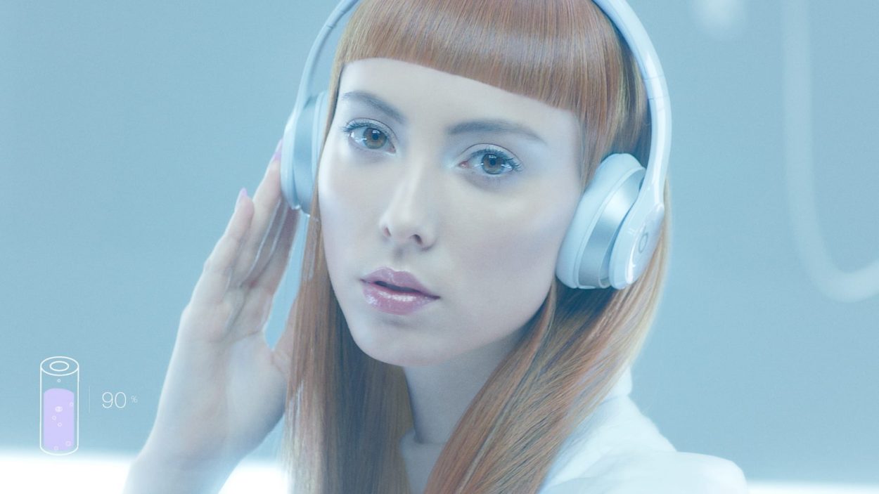
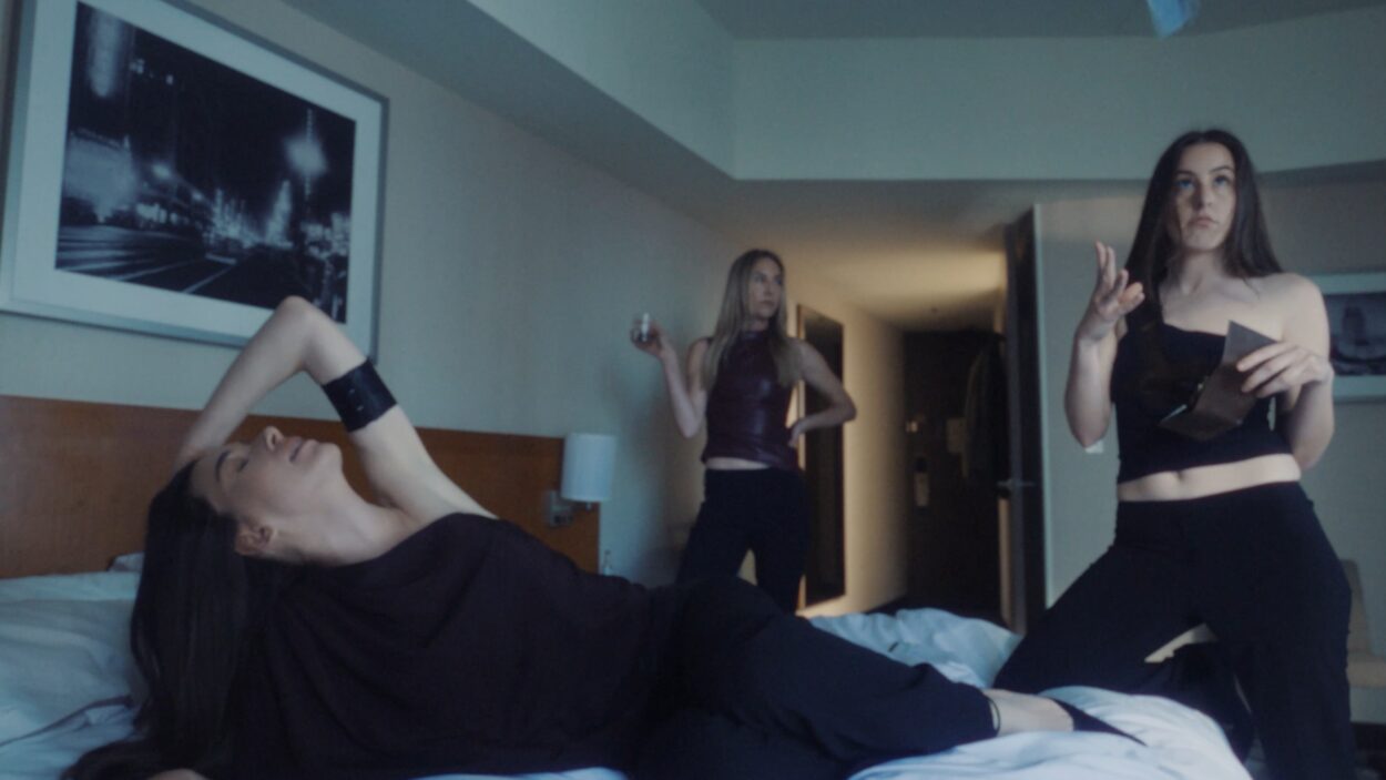
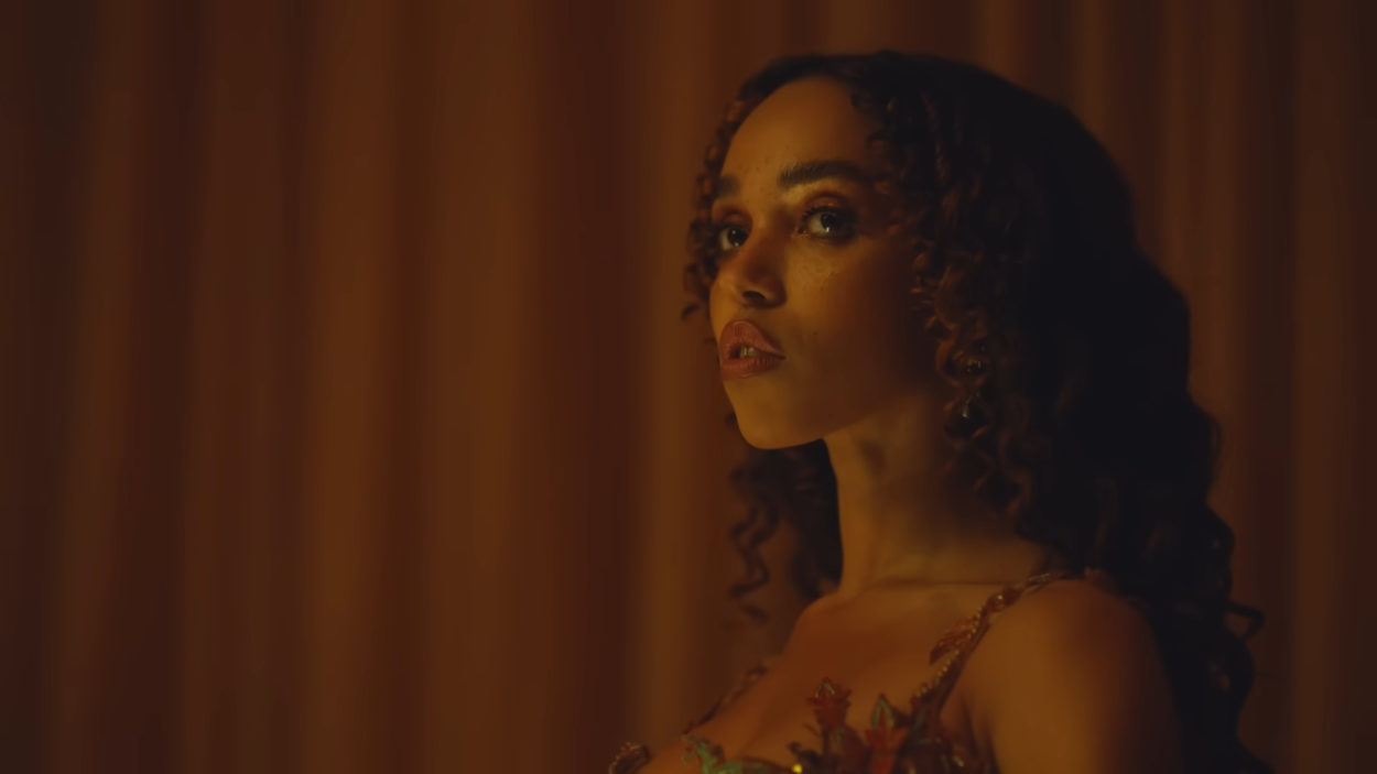
First things first – is your video a promo, an advert for a soft drink or a beauty commercial? We saw Spin comment that “the video is either a brilliant takedown of product placement or a no-fucks given, incredibly well-choreographed treatment”. So what is it?!
When talking with QT (Quinn Thomas) about her own process in producing the drink and the song it became clear that it was the same product in two different forms. So our aim was to develop a creative vision that would express both the effervescent energy of the song and the formulation of the QT Elixir, it’s a reflection of her process.
The video takes place within this testing environment to monitor and record QT’s emotional responses which were then distilled into quantifiable ingredients which form the composition of the energy drink. Whether the video functions as a promo, advertisement or both is ultimately up to the viewer; but we set out to challenge the definition of each medium and to question whether there even is a distinguishable difference.
How did the collaboration with QT come about? And how did the creative concept for the film come about?
We were super excited when the QT team invited us to collaborate on the film. At the beginning of the project we were shipped some Elixir pre-production samples and took the afternoon to experience the effect. We immediately got a sense of the energy which the drink provides so for us it was about taking all these feelings and emotions and distilling them down. We later visited the labs to see how the drink was being made. From that the concept for the film came together pretty fluidly, the thing with QT is that you can just kind of feel it.
Across your work you tend to bring a distinctive conceptual element to your films. What is it about this style or process that appeals to you both?
Concept is definitely a vital part of our collaborative process. It’s integral to the development of any treatment we do as it allows our ideas both visually and conceptually to grow, develop and most importantly clash; allowing us to challenge each other. For us it is the only place to start and provides the foundations to then develop the visuals on, rather than the other way round, which we think can often result in something which isn’t nearly as complete as it could be. It’s also important to us because we want to create engaging provocative pieces, which viewers can experience on multiple levels.
What are your main creative references or inspirations – your stained glass film taps biblical tropes while your QT promo touches on K-Pop music trends?
Being from slightly different backgrounds our sources of inspiration can vary a lot. Whether that be the stories within the ceilings of the Sistine Chapel, the aspirational tapering lines on the side of an Evian bottle or how contemporary working practices and the increasing digitization of contemporary life help to shape subjectivities and our environment. We are intrigued by space and love to create worlds which people can fall into.
Where our interests tend to intersect the most is with conceptual architecture on large or small scales, from domestic interiors to cities; our vision and process is often determined spatially and so we build spaces and environments which are then populated with layers of meaning and narrative.
Our work also draws reference from popular culture, in a kind of speculative storytelling. Reflecting on something that already exists and pushing the familiar to an uncomfortable or dramatised limit.
Anything else you’d like to say / share?
We’d really like to thank and credit the following of whom all put forward their amazing talents into this project: Tony C Miller (DOP),Mzhavanadze & Morfik (CGI Liquids), Anarchy (Set Design), Chris Roebeck (Edit), Happy Finish (Retouch & Grade) and of course WhiteLodge.
